Overview of the Performance Insights dashboard
The dashboard is the easiest way to interact with Performance Insights. The following example shows the dashboard for an Amazon DocumentDB instance. By default, the Performance Insights dashboard shows data for the last hour.
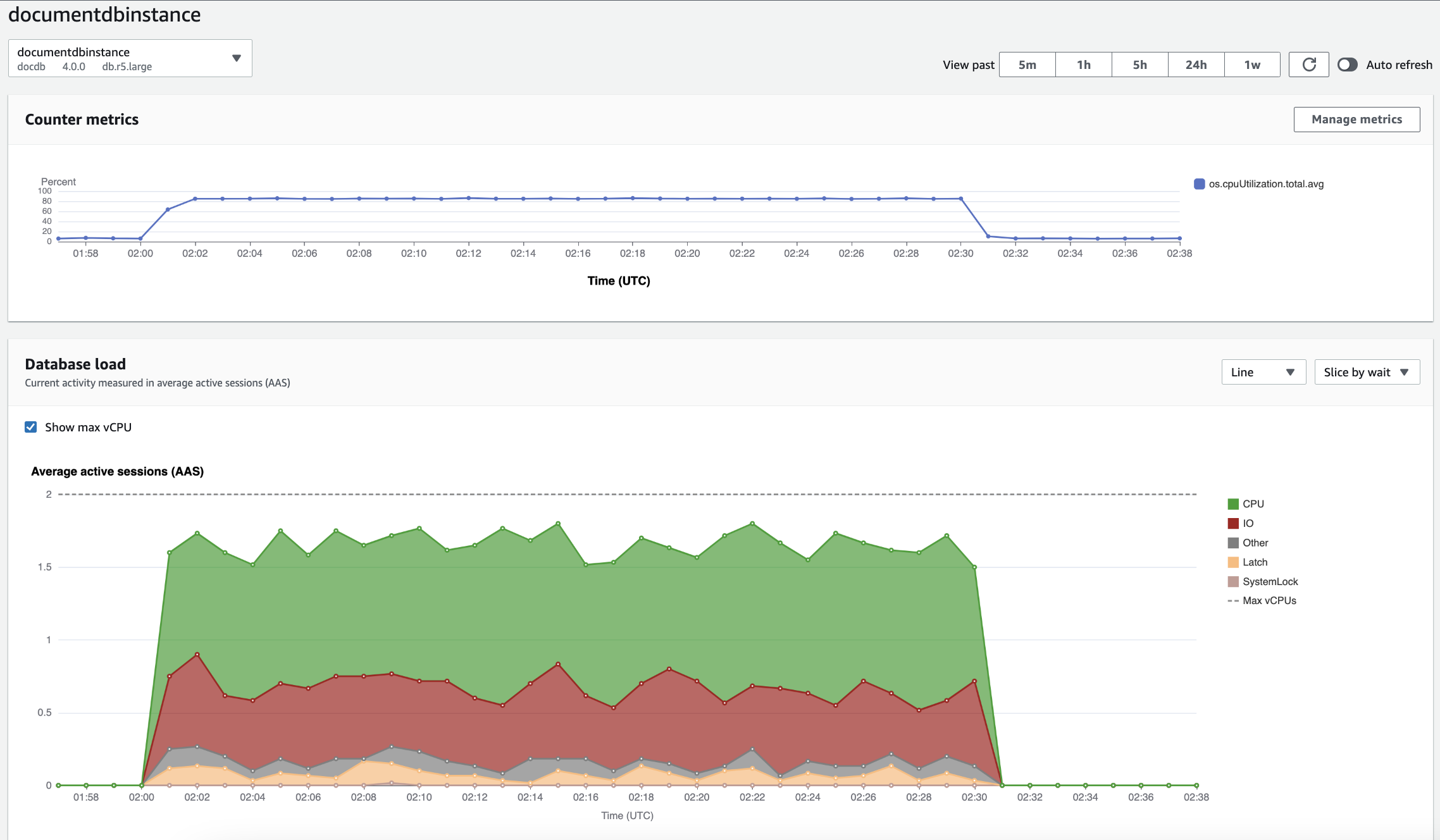
The dashboard is divided into the following parts:
-
Counter metrics – Shows data for specific performance counter metrics.
-
Database load – Shows how the DB load compares to DB instance capacity as represented by the Max vCPU line.
-
Top dimensions – Shows the top dimensions contributing to DB load. These dimensions include
waits,queries,hosts,databases, andapplications.
Counter metrics chart
With counter metrics, you can customize the Performance Insights dashboard to include up to 10 additional graphs. These graphs show a selection of dozens of operating system metrics. You can correlate this information with DB load to help identify and analyze performance problems.
The Counter metrics chart displays data for performance counters.
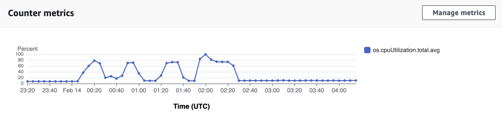
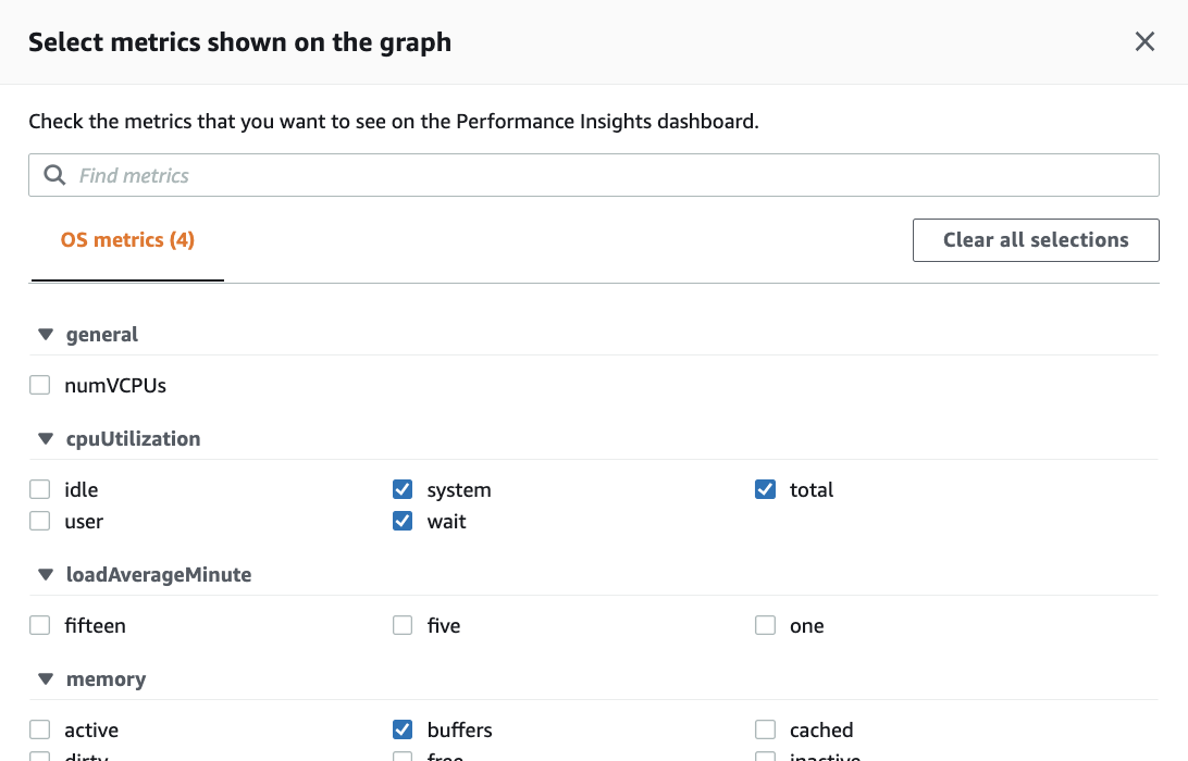
To change the performance counters, choose Manage metrics. You can select multiple OS metrics as shown in the following screenshot. To see details for any metric, hover over the metric name.
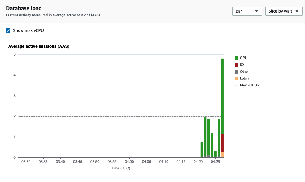
Database load chart
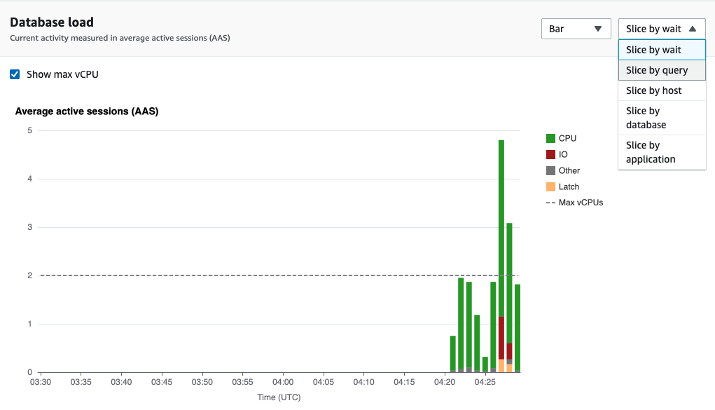
The Database load chart shows how the database activity compares to instance capacity as represented by the Max vCPU line. By default, the stacked line chart represents DB load as average active sessions per unit of time. The DB load is sliced (grouped) by wait states.
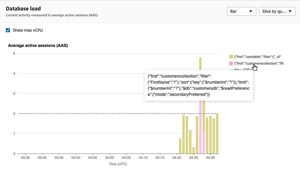
DB load sliced by dimensions
You can choose to display load as active sessions grouped by any supported dimensions. The following image shows the dimensions for the Amazon DocumentDB instance.
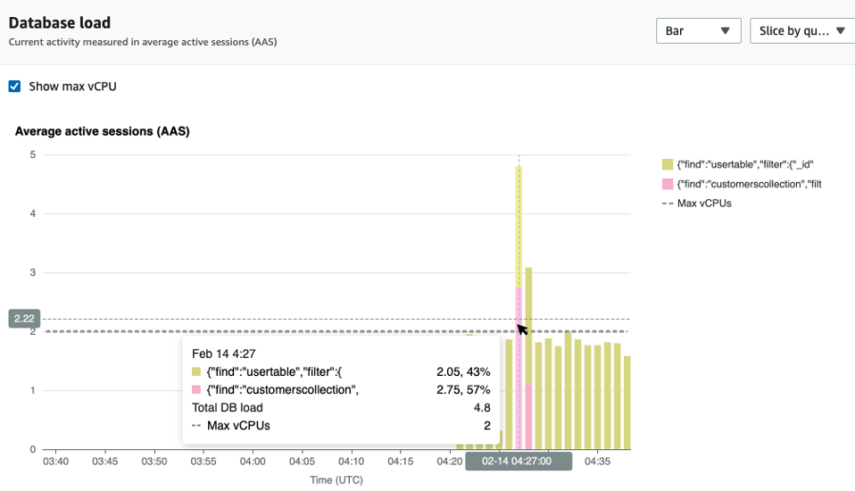
DB load details for a dimension item
To see details about a DB load item within a dimension, hover over the item name. The following image shows details for a query statement.
To see details for any item for the selected time period in the legend, hover over that item.
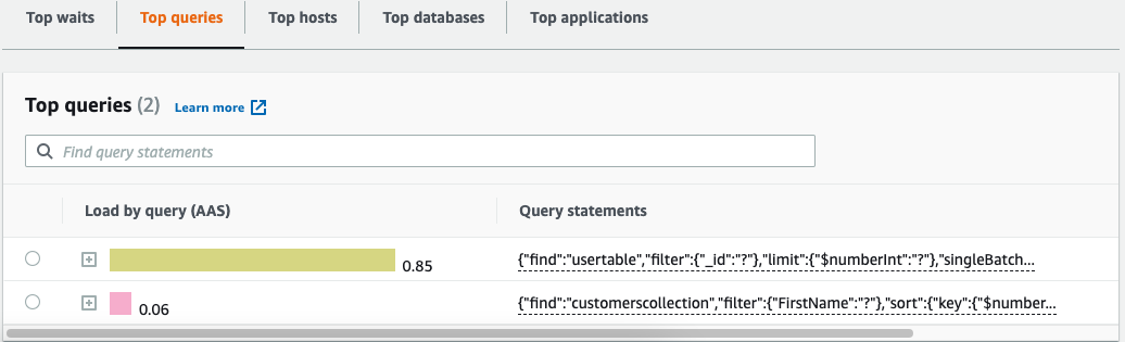
Top dimensions table
The Top dimensions table slices DB load by different dimensions. A dimension is a category or "slice by" for different characteristics of DB load. If the dimension is query, Top queries shows the query statements that contribute most to the DB load.
Choose any of the following dimension tabs.
The following table provides a brief description of each tab.
| Tab | Description |
|---|---|
|
Top waits |
The event for which the database backend is waiting |
|
Top queries |
The query statements that are currently running |
|
Top hosts |
The host IP and port of the connected client |
|
Top databases |
The name of the database to which the client is connected |
|
Top applications |
The name of the application that is connected to the database |
To learn how to analyze queries by using the Top queries tab, see Overview of the Top queries tab.