The SiteWise Monitor feature is not available to new customers. Existing customers can continue to use the service as normal. For more information, see SiteWise Monitor availability change
Configure thresholds
As a project owner, you can configure thresholds for your visualizations to indicate when asset properties are outside their normal operating ranges. When you add a threshold, you define a rule and a color. If at least one of a property's data points crosses the threshold for a selected time range, the visualization displays that property's legend in the color that you choose. You can choose if the visualization also displays the property's data in the color that you choose. You can add multiple thresholds to each visualization, and choose colors to represent severities.
Note
If you add a property with an alarm to a visualization, the visualization automatically displays the alarm as a threshold.
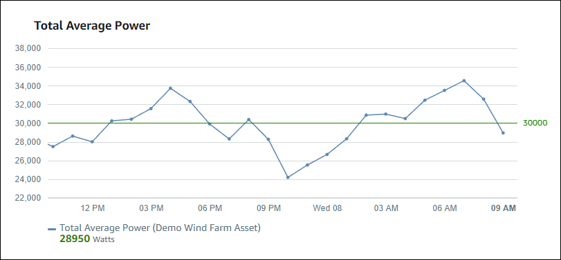
The threshold in the following example indicates when a wind farm's total power output is less than 30,000 watts. The visualization displays the legend in green because the property value meets the threshold.

When multiple thresholds apply to a data point, SiteWise Monitor uses the following rules to choose which threshold's color to display:
-
If the data point is positive or zero, the visualization displays the color of the threshold with the greatest value.
-
If the data point is negative, the visualization displays the color of the threshold with the most negative value.
-
If the data point meets multiple thresholds with the same value, the visualization displays the color of the last threshold that you added.
Note
SiteWise Monitor rounds data points in visualizations but uses the actual value to compare with thresholds. Consider an example where you have a data point with value 5.549. This data point displays as 5.55, but the data point won't meet a threshold that checks for data points greater than or equal to 5.55.
Add a threshold to a visualization
As a project owner, you can define thresholds for each visualization.
Note
You can add up to six thresholds to each visualization.
To add a threshold to a visualization
-
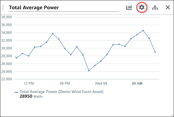
Choose the Configuration icon for the visualization to change.

-
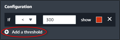
If the visualization already has a threshold, choose Add a threshold to add a new threshold.

-
Choose one of the following comparison operators:
-
< – Highlight properties that have at least one data point less than the specified value.
-
> – Highlight properties that have at least one data point greater than the specified value.
-
≤ – Highlight properties that have at least one data point less than or equal to the specified value.
-
≥ – Highlight properties that have at least one data point greater than or equal to the specified value.
-
= – Highlight properties that have at least one data point equal to the specified value.
-
-
Enter a threshold value to compare data points with the specified operator.
-
Choose a threshold color. The visualization displays property legends in this color for properties with at least one data point that meets the threshold rule. When you enable Color breached values, the visualization also colors data that meets the threshold rule. You can use the color picker, enter a hexadecimal color code, or enter color component values.
-
(Optional) Toggle Color breached values. When you enable this option, the visualization displays the data in color when it meets the threshold.
-
After you finish editing the dashboard, choose Save dashboard to save your changes. The dashboard editor closes. If you try to close a dashboard that has unsaved changes, you're prompted to save them.
Remove a threshold from a visualization
As a project owner, you can remove a threshold from a visualization if you no longer need it.
To remove a threshold from a visualization
-
Choose the Configuration icon for the visualization to change.
-
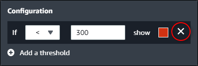
Choose the X icon for the threshold to remove.

-
After you finish editing the dashboard, choose Save dashboard to save your changes. The dashboard editor closes. If you try to close a dashboard that has unsaved changes, you're prompted to save them.