Exploring anomalies per category or dimension
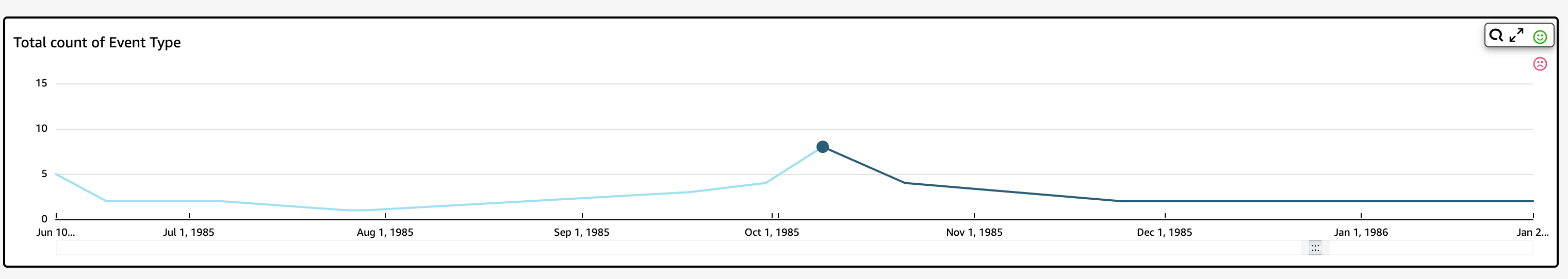
The main section of the Explore anomalies screen is locked to the lower right of the screen. It remains here no matter how many other sections of the screen are open. If multiple anomalies exist, you can scroll out to highlight them. The chart displays anomalies in color ranges and shows where they occur over a period of time.
Each category or dimension has a separate chart that uses the field name as the chart title. Each chart contains the following components:
-
Configure alerts – If you are exploring anomalies from a dashboard, select this button to subscribe to alerts and contribution analysis (if configured). You can set up the alerts for the level of severity (medium, high, and so on). You can get the top five alerts for Higher than expected, Lower than expected, or ALL. Dashboard readers can configure alerts for themselves. If you open the Explore Anomalies page doesn't display this button if you opened the page from an analysis.
Note
The ability to configure alerts is available only in published dashboards.
-
Status – Under the Anomalies header, the status label displays information on the last run. For example, you might see "Anomalies for Revenue on November 17, 2018." This label tells you how many metrics were processed and how long ago. You can choose the link to learn more about the details, such as how many metrics were ignored.