Amazon Redshift will no longer support the use of Python UDFs after June 30, 2026.
We will start enforcing it in phases. For more information on the details of Python end of life
and migration options, see the
blog post
Viewing cluster performance data
By using cluster metrics in Amazon Redshift, you can do the following common performance tasks:
-
Determine if cluster metrics are abnormal over a specified time range and, if so, identify the queries responsible for the performance hit.
-
Check if historical or current queries are impacting cluster performance. If you identify a problematic query, you can view details about it including the cluster performance during the query's execution. You can use this information in diagnosing why the query was slow and what can be done to improve its performance.
To view performance data
-
Sign in to the Amazon Web Services Management Console and open the Amazon Redshift console at https://console.amazonaws.cn/redshiftv2/
. -
On the navigation menu, choose Clusters, then choose the name of a cluster from the list to open its details. The details of the cluster are displayed, which can include Cluster performance, Query monitoring, Databases, Datashares, Schedules, Maintenance, and Properties tabs.
-
Choose the Cluster performance tab for performance information including the following:
-
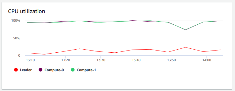
CPU utilization
-
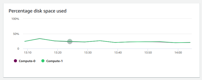
Percentage disk space used
-
Database connections
-
Health status
-
Query duration
-
Query throughput
-
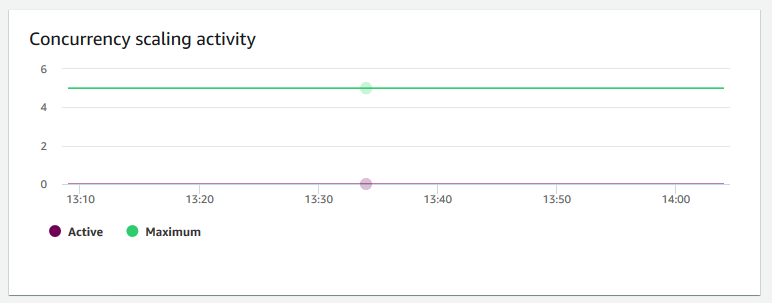
Concurrency scaling activity
Many more metrics are available. To see the available metrics and choose which are displayed, choose the Preferences icon.
-
Cluster performance graphs
The following examples show some of the graphs that are displayed in the new Amazon Redshift console.
-
CPU utilization – Shows the percentage of CPU utilization for all nodes (leader and compute). To find a time when the cluster usage is lowest before scheduling cluster migration or other resource-consuming operations, monitor this chart to see CPU utilization per individual or all of nodes.
-
Maintenance mode – Shows whether the cluster is in the maintenance mode at a chosen time by using
OnandOffindicators. You can see the time when the cluster is undergoing maintenance. You can then correlate this time to operations that are done to the cluster to estimate its future downtimes for recurring events.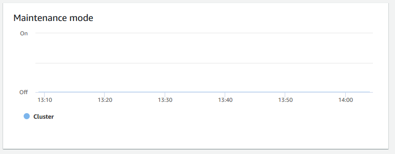
-
Percentage disk space used – Shows the percentage of disk space usage per each compute node, and not for the cluster as a whole. You can explore this chart to monitor the disk utilization. Maintenance operations like VACUUM and COPY use intermediate temporary storage space for their sort operations, so a spike in disk usage is expected.
-
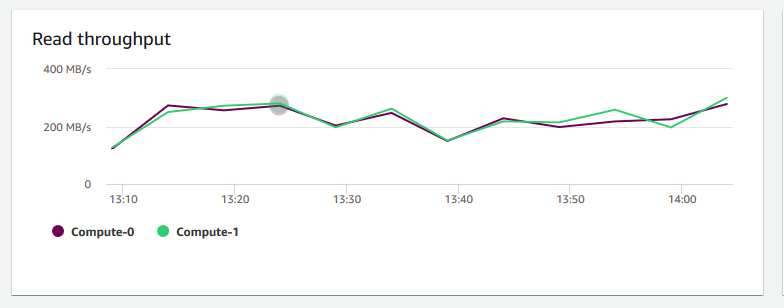
Read throughput – Shows the average number of megabytes read from disk per second. You can evaluate this chart to monitor the corresponding physical aspect of the cluster. This throughput doesn't include network traffic between instances in the cluster and its volume.
-
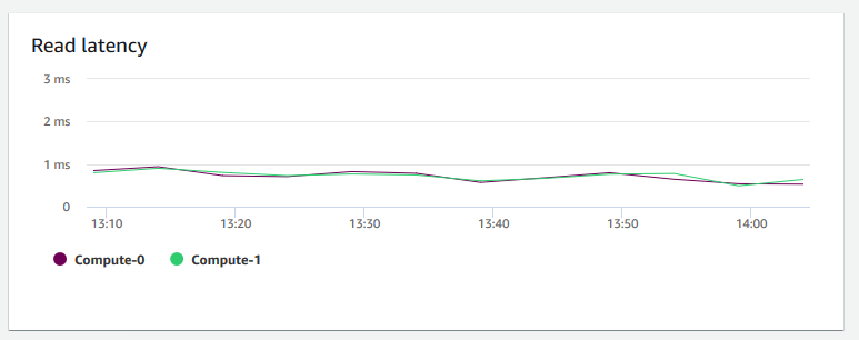
Read latency – Shows the average amount of time taken for disk read I/O operations per millisecond. You can view the response times for the data to return. When latency is high, it means that the sender spends more time idle (not sending any new packets), which reduces how fast throughput grows.
-
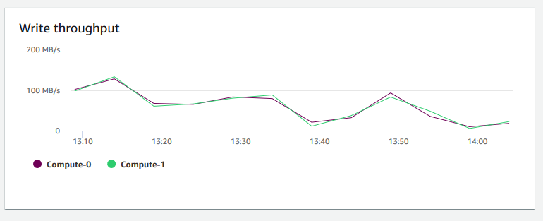
Write throughput – Shows the average number of megabytes written to disk per second. You can evaluate this metric to monitor the corresponding physical aspect of the cluster. This throughput doesn't include network traffic between instances in the cluster and its volume.
-
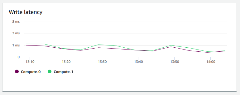
Write latency – Shows the average amount of time in milliseconds taken for disk write I/O operations. You can evaluate the time for the write acknowledgment to return. When latency is high, it means that the sender spends more time idle (not sending any new packets), which reduces how fast throughput grows.
-
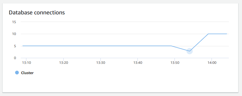
Database connections – Shows the number of database connections to a cluster. You can use this chart to see how many connections are established to the database and find a time when the cluster usage is lowest.
-
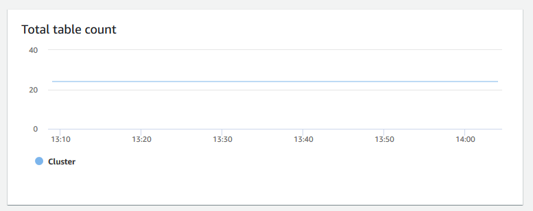
Total table count – Shows the number of user tables open at a particular point in time within a cluster. You can monitor the cluster performance when open table count is high.
-
Health status – Indicates the health of the cluster as
HealthyorUnhealthy. If the cluster can connect to its database and performs a simple query successfully, the cluster is considered healthy. Otherwise, the cluster is unhealthy. An unhealthy status can occur when the cluster database is under extremely heavy load or if there is a configuration problem with a database on the cluster.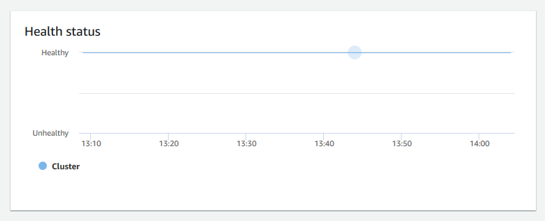
-
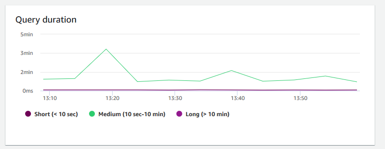
Query duration – Shows the average amount of time to complete a query in microseconds. You can benchmark the data on this chart to measure I/O performance within the cluster and tune its most time-consuming queries if necessary.
-
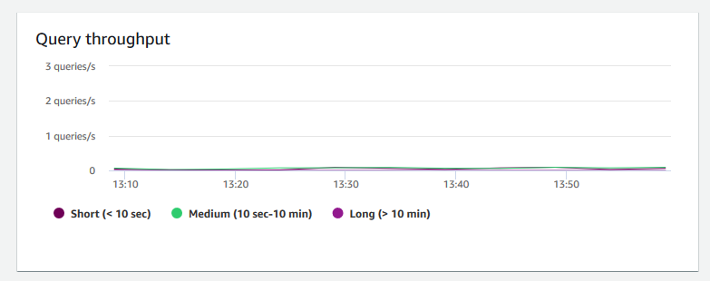
Query throughput – Shows the average number of completed queries per second. You can analyze data on this chart to measure database performance and characterize the ability of the system to support a multiuser workload in a balanced way.
-
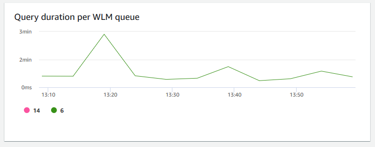
Query duration per WLM queue – Shows the average amount of time to complete a query in microseconds. You can benchmark the data on this chart to measure I/O performance per WLM queue and tune its most time-consuming queries if necessary.
-
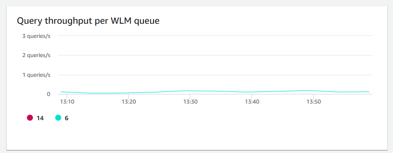
Query throughput per WLM queue – Shows the average number of completed queries per second. You can analyze data on this chart to measure database performance per WLM queue.
-
Concurrency scaling activity – Shows the number of active concurrency scaling clusters. When concurrency scaling is enabled, Amazon Redshift automatically adds additional cluster capacity when you need it to process an increase in concurrent read queries.