Analyze and Visualize
Amazon SageMaker Data Wrangler includes built-in analyses that help you generate visualizations and data analyses in a few clicks. You can also create custom analyses using your own code.
You add an analysis to a dataframe by selecting a step in your data flow, and then choosing Add analysis. To access an analysis you've created, select the step that contains the analysis, and select the analysis.
All analyses are generated using 100,000 rows of your dataset.
You can add the following analysis to a dataframe:
-
Data visualizations, including histograms and scatter plots.
-
A quick summary of your dataset, including number of entries, minimum and maximum values (for numeric data), and most and least frequent categories (for categorical data).
-
A quick model of the dataset, which can be used to generate an importance score for each feature.
-
A target leakage report, which you can use to determine if one or more features are strongly correlated with your target feature.
-
A custom visualization using your own code.
Use the following sections to learn more about these options.
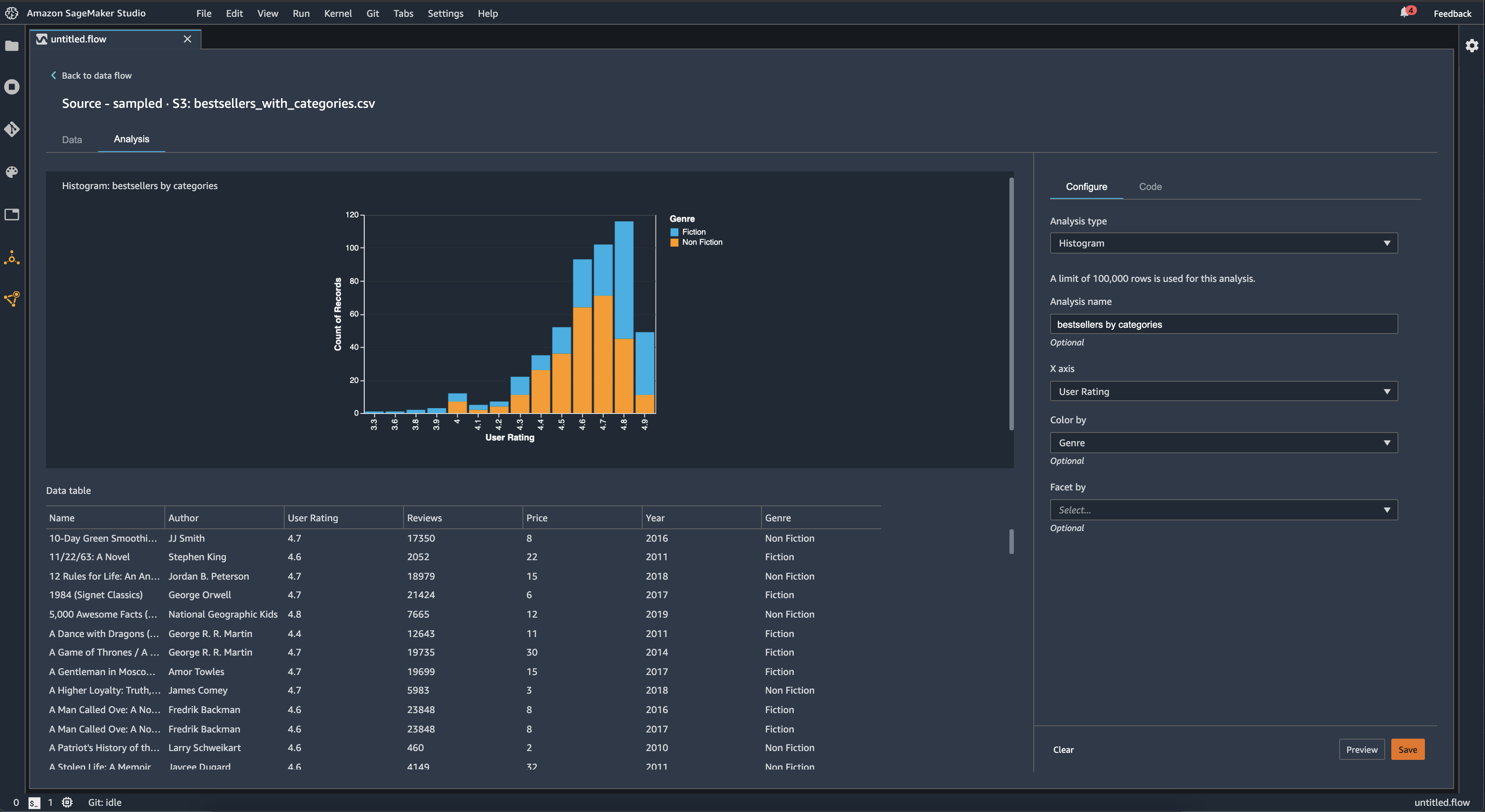
Histogram
Use histograms to see the counts of feature values for a specific feature. You can inspect the relationships between features using the Color by option. For example, the following histogram charts the distribution of user ratings of the best-selling books on Amazon from 2009–2019, colored by genre.
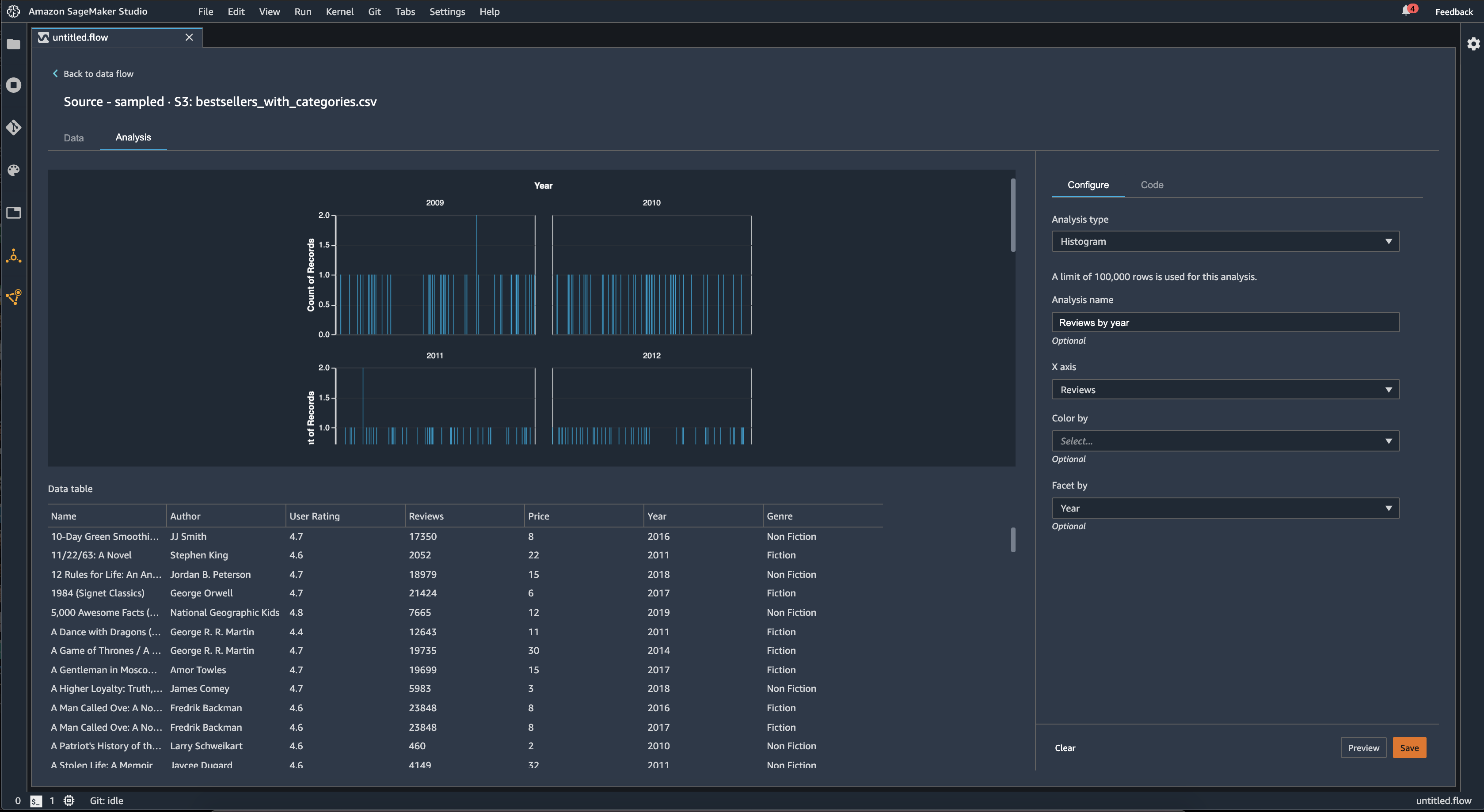
You can use the Facet by feature to create histograms of one column, for each value in another column. For example, the following diagram shows histograms of user reviews of best-selling books on Amazon if faceted by year.
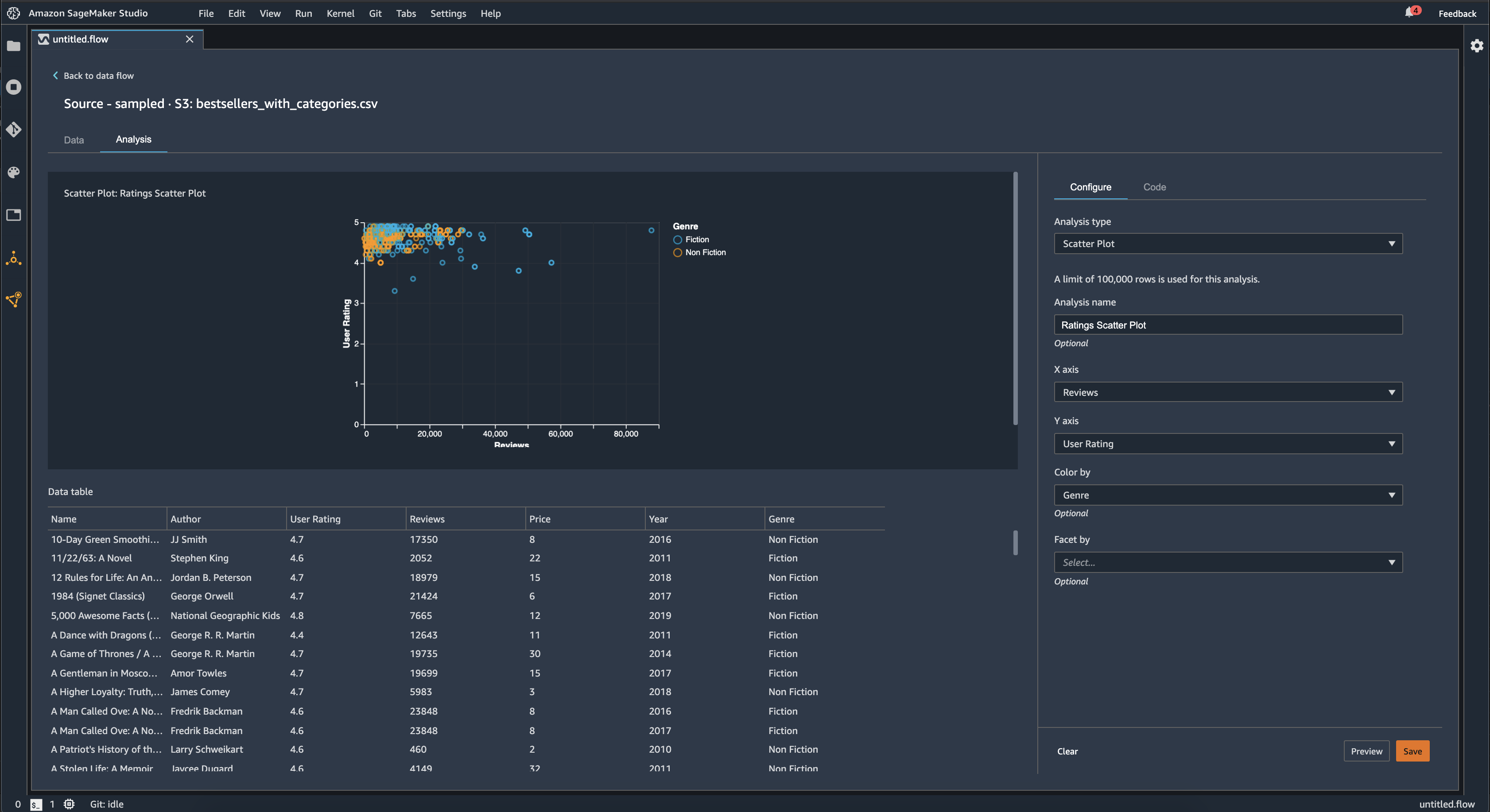
Scatter Plot
Use the Scatter Plot feature to inspect the relationship between features. To create a scatter plot, select a feature to plot on the X axis and the Y axis. Both of these columns must be numeric typed columns.
You can color scatter plots by an additional column. For example, the following example shows a scatter plot comparing the number of reviews against user ratings of top-selling books on Amazon between 2009 and 2019. The scatter plot is colored by book genre.
Additionally, you can facet scatter plots by features. For example, the following image shows an example of the same review versus user rating scatter plot, faceted by year.
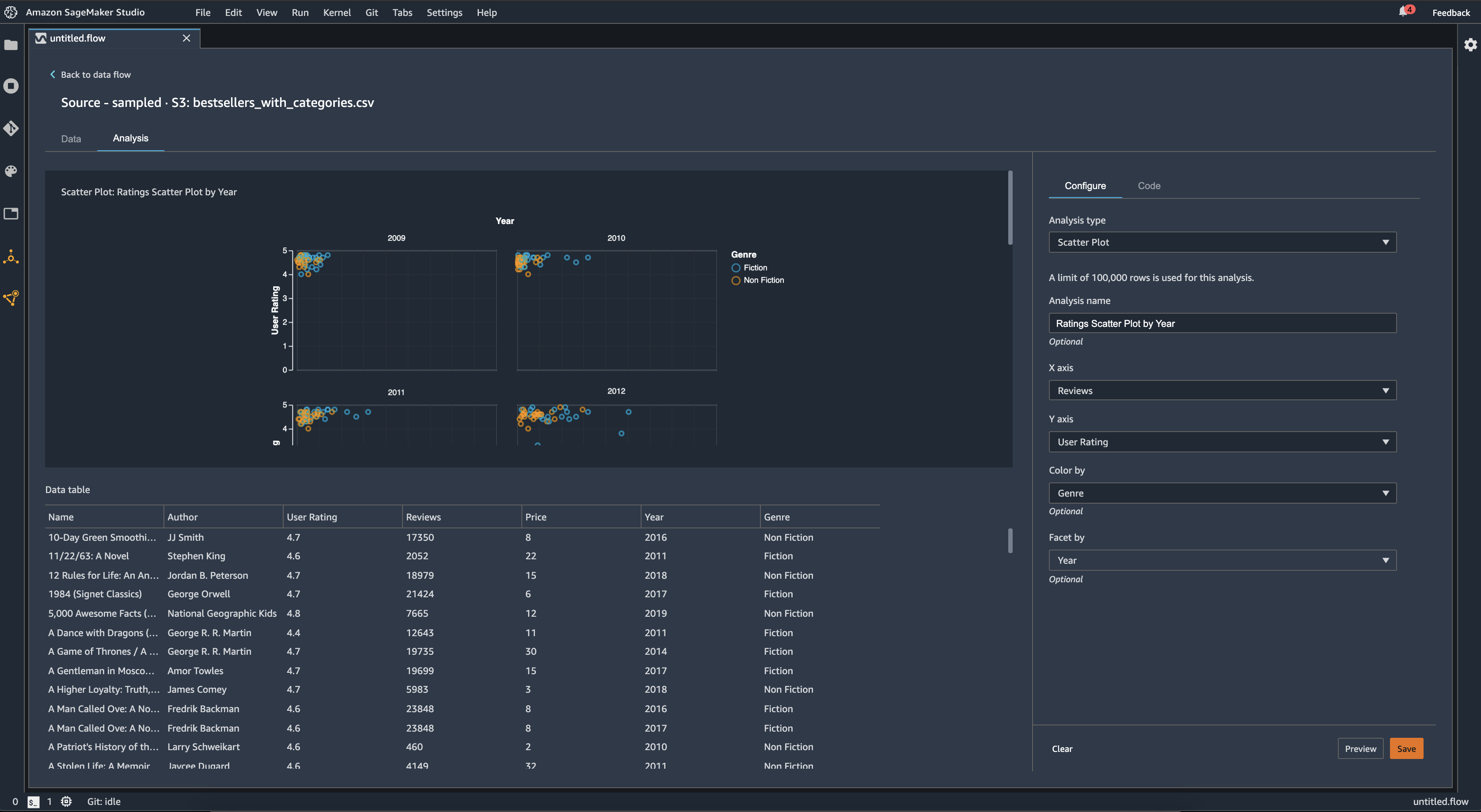
Table Summary
Use the Table Summary analysis to quickly summarize your data.
For columns with numerical data, including log and float data, a table summary reports the number of entries (count), minimum (min), maximum (max), mean, and standard deviation (stddev) for each column.
For columns with non-numerical data, including columns with string, Boolean, or date/time data, a table summary reports the number of entries (count), least frequent value (min), and most frequent value (max).
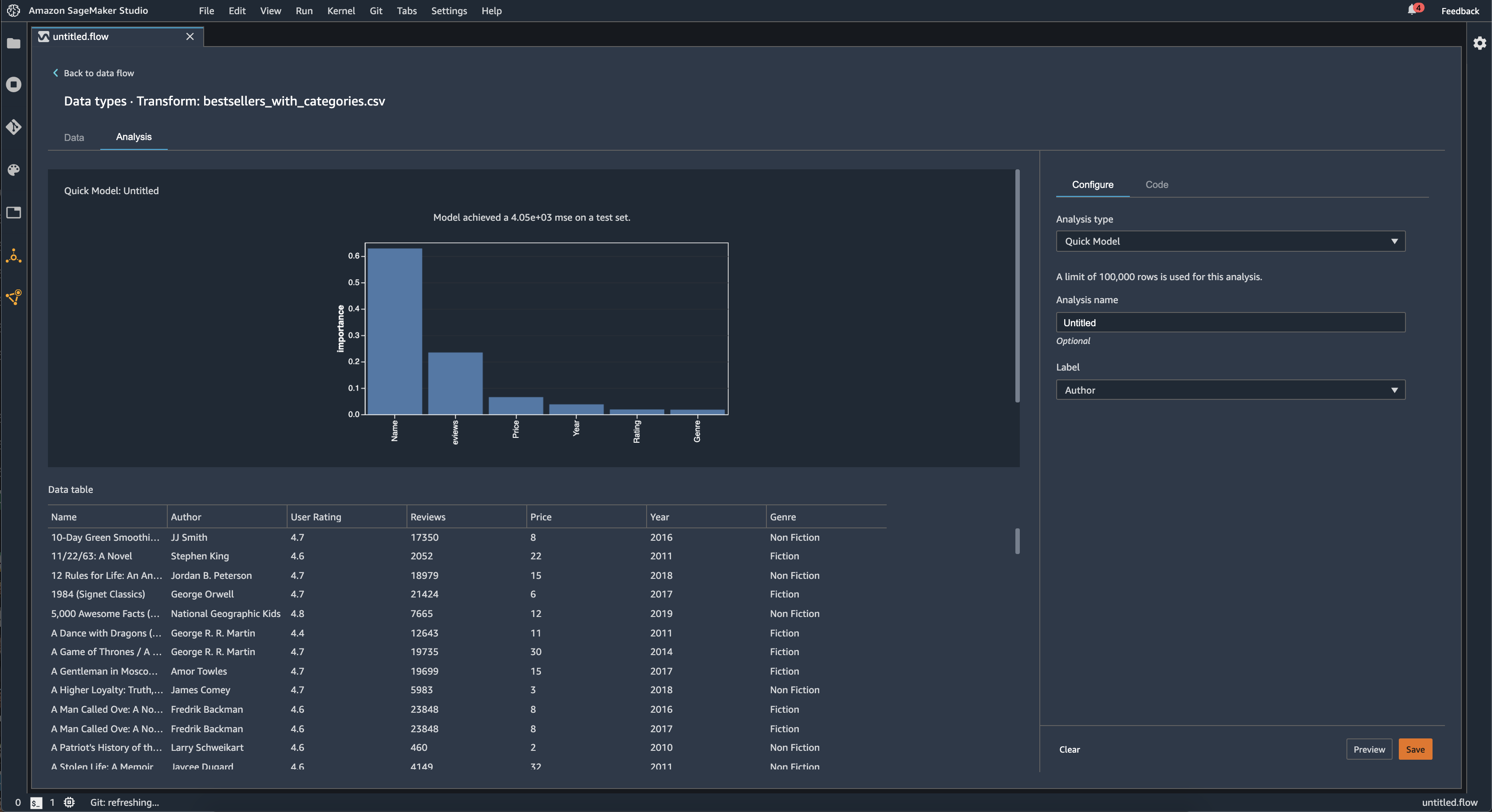
Quick Model
Use the Quick Model visualization to quickly evaluate your data
and produce importance scores for each feature. A feature importance score
When you create a quick model chart, you select a dataset you want evaluated, and a target label against which you want feature importance to be compared. Data Wrangler does the following:
-
Infers the data types for the target label and each feature in the dataset selected.
-
Determines the problem type. Based on the number of distinct values in the label column, Data Wrangler determines if this is a regression or classification problem type. Data Wrangler sets a categorical threshold to 100. If there are more than 100 distinct values in the label column, Data Wrangler classifies it as a regression problem; otherwise, it is classified as a classification problem.
-
Pre-processes features and label data for training. The algorithm used requires encoding features to vector type and encoding labels to double type.
-
Trains a random forest algorithm with 70% of data. Spark’s RandomForestRegressor
is used to train a model for regression problems. The RandomForestClassifier is used to train a model for classification problems. -
Evaluates a random forest model with the remaining 30% of data. Data Wrangler evaluates classification models using an F1 score and evaluates regression models using an MSE score.
-
Calculates feature importance for each feature using the Gini importance method.
The following image shows the user interface for the quick model feature.
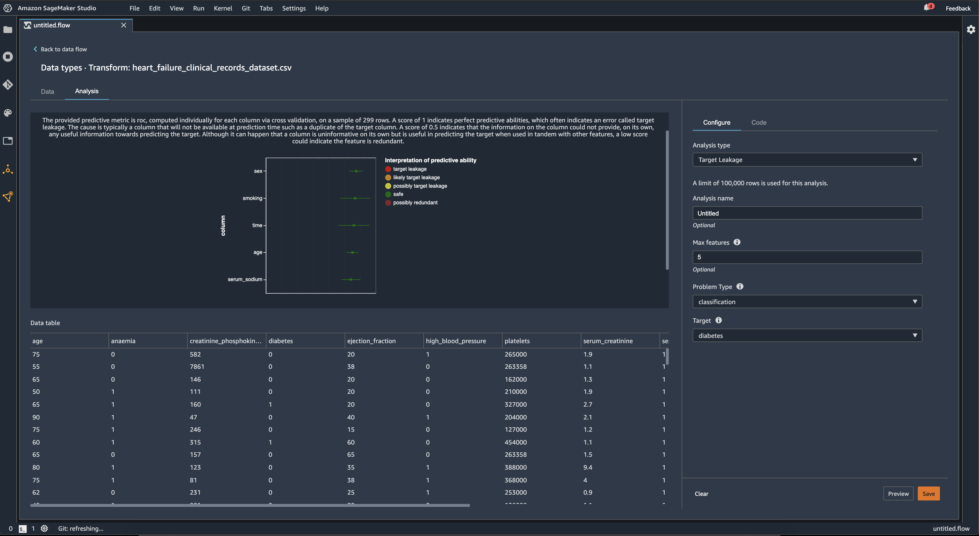
Target Leakage
Target leakage occurs when there is data in a machine learning training dataset that is strongly correlated with the target label, but is not available in real-world data. For example, you may have a column in your dataset that serves as a proxy for the column you want to predict with your model.
When you use the Target Leakage analysis, you specify the following:
-
Target: This is the feature about which you want your ML model to be able to make predictions.
-
Problem type: This is the ML problem type on which you are working. Problem type can either be classification or regression.
-
(Optional) Max features: This is the maximum number of features to present in the visualization, which shows features ranked by their risk of being target leakage.
For classification, the target leakage analysis uses the area under the receiver operating characteristic, or AUC - ROC curve for each column, up to Max features. For regression, it uses a coefficient of determination, or R2 metric.
The AUC - ROC curve provides a predictive metric, computed individually for each column using cross-validation, on a sample of up to around 1000 rows. A score of 1 indicates perfect predictive abilities, which often indicates target leakage. A score of 0.5 or lower indicates that the information on the column could not provide, on its own, any useful information towards predicting the target. Although it can happen that a column is uninformative on its own but is useful in predicting the target when used in tandem with other features, a low score could indicate the feature is redundant.
For example, the following image shows a target leakage report for a diabetes classification problem, that is, predicting if a person has diabetes or not. An AUC - ROC curve is used to calculate the predictive ability of five features, and all are determined to be safe from target leakage.
Multicollinearity
Multicollinearity is a circumstance where two or more predictor variables are related to each other. The predictor variables are the features in your dataset that you're using to predict a target variable. When you have multicollinearity, the predictor variables are not only predictive of the target variable, but also predictive of each other.
You can use the Variance Inflation Factor (VIF), Principal Component Analysis (PCA), or Lasso feature selection as measures for the multicollinearity in your data. For more information, see the following.
Detect Anomalies In Time Series Data
You can use the anomaly detection visualization to see outliers in your time series data. To understand what determines an anomaly, you need to understand that we decompose the time series into a predicted term and an error term. We treat the seasonality and trend of the time series as the predicted term. We treat the residuals as the error term.
For the error term, you specify a threshold as the number of standard of deviations the residual can be away from the mean for it to be considered an anomaly. For example, you can specify a threshold as being 3 standard deviations. Any residual greater than 3 standard deviations away from the mean is an anomaly.
You can use the following procedure to perform an Anomaly detection analysis.
-
Open your Data Wrangler data flow.
-
In your data flow, under Data types, choose the +, and select Add analysis.
-
For Analysis type, choose Time Series.
-
For Visualization, choose Anomaly detection.
-
For Anomaly threshold, choose the threshold that a value is considered an anomaly.
-
Choose Preview to generate a preview of the analysis.
-
Choose Add to add the transform to the Data Wrangler data flow.
Seasonal Trend Decomposition In Time Series Data
You can determine whether there's seasonality in your time series data by using the Seasonal Trend Decomposition visualization. We use the STL (Seasonal Trend decomposition using LOESS) method to perform the decomposition. We decompose the time series into its seasonal, trend, and residual components. The trend reflects the long term progression of the series. The seasonal component is a signal that recurs in a time period. After removing the trend and the seasonal components from the time series, you have the residual.
You can use the following procedure to perform a Seasonal-Trend decomposition analysis.
-
Open your Data Wrangler data flow.
-
In your data flow, under Data types, choose the +, and select Add analysis.
-
For Analysis type, choose Time Series.
-
For Visualization, choose Seasonal-Trend decomposition.
-
For Anomaly threshold, choose the threshold that a value is considered an anomaly.
-
Choose Preview to generate a preview of the analysis.
-
Choose Add to add the transform to the Data Wrangler data flow.
Bias Report
You can use the bias report in Data Wrangler to uncover potential biases in your data. To generate a bias report, you must specify the target column, or Label, that you want to predict and a Facet, or the column that you want to inspect for biases.
Label: The feature about which you want a model to make predictions. For example, if you are predicting customer conversion, you may select a column containing data on whether or not a customer has placed an order. You must also specify whether this feature is a label or a threshold. If you specify a label, you must specify what a positive outcome looks like in your data. In the customer conversion example, a positive outcome may be a 1 in the orders column, representing the positive outcome of a customer placing an order within the last three months. If you specify a threshold, you must specify a lower bound defining a positive outcome. For example, if your customer orders columns contains the number of orders placed in the last year, you may want to specify 1.
Facet: The column that you want to inspect for biases. For example, if you are trying to predict customer conversion, your facet may be the age of the customer. You may choose this facet because you believe that your data is biased toward a certain age group. You must identify whether the facet is measured as a value or threshold. For example, if you wanted to inspect one or more specific ages, you select Value and specify those ages. If you want to look at an age group, you select Threshold and specify the threshold of ages you want to inspect.
After you select your feature and label, you select the types of bias metrics you want to calculate.
To learn more, see Generate reports for bias in pre-training data.
Create Custom Visualizations
You can add an analysis to your Data Wrangler flow to create a custom visualization. Your
dataset, with all the transformations you've applied, is available as a Pandas DataFramedf variable to store the
dataframe. You access the dataframe by calling the variable.
You must provide the output variable, chart, to store an Altair
import altair as alt
df = df.iloc[:30]
df = df.rename(columns={"Age": "value"})
df = df.assign(count=df.groupby('value').value.transform('count'))
df = df[["value", "count"]]
base = alt.Chart(df)
bar = base.mark_bar().encode(x=alt.X('value', bin=True, axis=None), y=alt.Y('count'))
rule = base.mark_rule(color='red').encode(
    x='mean(value):Q',
    size=alt.value(5))
chart = bar + rule
To create a custom visualization:
-
Next to the node containing the transformation that you'd like to visualize, choose the +.
-
Choose Add analysis.
-
For Analysis type, choose Custom Visualization.
-
For Analysis name, specify a name.
-
Enter your code in the code box.
-
Choose Preview to preview your visualization.
-
Choose Save to add your visualization.
If you don’t know how to use the Altair visualization package in Python, you can use custom code snippets to help you get started.
Data Wrangler has a searchable collection of visualization snippets. To use a visualization snippet, choose Search example snippets and specify a query in the search bar.
The following example uses the Binned scatterplot code snippet. It plots a histogram for 2 dimensions.
The snippets have comments to help you understand the changes that you need to make to the code. You usually need to specify the column names of your dataset in the code.
import altair as alt

# Specify the number of top rows for plotting
rows_number = 1000
df = df.head(rows_number)
# You can also choose bottom rows or randomly sampled rows
# df = df.tail(rows_number)
# df = df.sample(rows_number)


chart = (
    alt.Chart(df)
    .mark_circle()
    .encode(
        # Specify the column names for binning and number of bins for X and Y axis
        x=alt.X("col1:Q", bin=alt.Bin(maxbins=20)),
        y=alt.Y("col2:Q", bin=alt.Bin(maxbins=20)),
        size="count()",
    )
)

# :Q specifies that label column has quantitative type.
# For more details on Altair typing refer to
# https://altair-viz.github.io/user_guide/encoding.html#encoding-data-types