Exploring outliers and key drivers with ML-powered anomaly detection and contribution analysis - Amazon QuickSight
Services or capabilities described in Amazon Web Services documentation might vary by Region. To see the differences applicable to the China Regions, see Getting Started with Amazon Web Services in China (PDF).

Exploring outliers and key drivers with ML-powered anomaly detection and contribution analysis

You can interactively explore the anomalies (also known as outliers) in your analysis, along with the contributors (key drivers). The analysis is available for you to explore after the ML-powered anomaly detection runs. The changes you make in this screen aren't saved when you go back to the analysis.

To begin, choose Explore anomalies in the insight. The following screenshot shows the anomalies screen as it appears when you first open it. In this example, contributors analysis is set up and shows two key drivers.

Anomalies analysis with contributors shown.

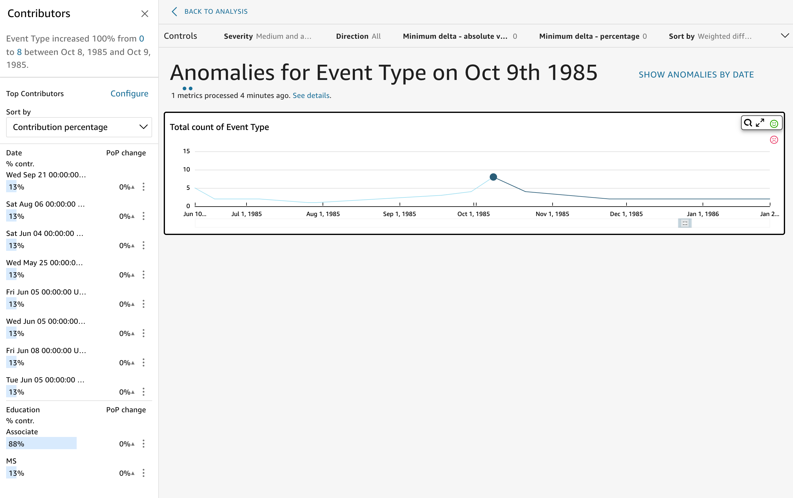
The sections of the screen include the following, from top left to bottom right:

  • Contributors displays key drivers. To see this section, you need to have contributors set up in your anomaly configuration.

  • Controls contains settings for anomaly exploration.

  • Number of anomalies displays outliers detected over time. You can hide or show this chart section.

  • Your field names for category or dimension fields act as titles for charts that show anomalies for each category or dimension.

The following sections provide detailed information for each aspect of exploring anomalies.

Exploring contributors (key drivers)

If your anomaly insight is set up to detect key drivers, QuickSight runs the contribution analysis to determine which categories (dimensions) are influencing the outliers. The Contributors section appears on the left.

Contributors panel.

Contributors contains the following sections:

  • Narrative – At top left, a summary describes any changes in the metrics.

  • Top contributors configuration – Choose Configure to change the contributors and the date range to use in this section.

  • Sort by – Sets the sort applied to the results that appear below. You can choose from the following:

    • Absolute difference

    • Contribution percentage (default)

    • Deviation from expected

    • Percentage difference

  • Top contributor results – Displays the results of the top contributor analysis for the point in time selected on the timeline at right.

    Contribution analysis identifies up to four of the top contributing factors or key drivers of an anomaly. For example, Amazon QuickSight can show you the top customers that contributed to a spike in sales in the US for health products. This panel appears only if you choose to include fields in contribution analysis when you configure the anomaly.

    If you don't see this panel and you want to display it, you can turn it on. To do so, go to the analysis, choose anomaly configuration from the insight's menu, and choose up to four fields to analyze for contributions. If you make changes in the sheet controls that exclude the contributing drivers, the Contributions panel closes.

Setting controls for anomaly detection

You can find the settings for anomaly detection in the Controls section of the screen. You can open and close this section by clicking the word Controls.

Choose Controls to open the Controls sections.

The settings include the following:

  • Controls – The current settings appear at the top of the workspace. You can expand this section by choosing the double arrow icon on the right side. The following settings are available for exploring outliers generated by ML-powered anomaly detection:

    • Severity – Sets how sensitive your detector is to detected anomalies (outliers). You should expect to see more anomalies with the threshold set to Low and above, and fewer anomalies when the threshold is set to High and above. This sensitivity is determined based on standard deviations of the anomaly score generated by the RCF algorithm. The default is Medium and above.

    • Direction – The direction on the x-axis or y-axis that you want to identify as anomalous. The default is [ALL]. You can choose the following:

      • Set to Higher than expected to identify higher values as anomalies.

      • Set to Lower than expected to identify lower values as anomalies.

      • Set to [ALL] to identify all anomalous values, both high and low.

    • Minimum Delta - absolute value – Enter a custom value to use to as the absolute threshold to identify anomalies. Any amount higher than this value counts as an anomaly.

    • Minimum Delta - percentage – Enter a custom value to use to as the percentage threshold to identify anomalies. Any amount higher than this value counts as an anomaly.

    • Sort by – Choose the method that you want to apply to sorting anomalies. These are listed in preferred order on the screen. View the following list for a description of each method.

      • Weighted anomaly score – The anomaly score multiplied by the log of the absolute value of the difference between the actual value and the expected value. This score is always a positive number.

      • Anomaly score – The actual anomaly score assigned to this data point.

      • Weighted difference from expected value – (Default) The anomaly score multiplied by the difference between the actual value and the expected value.

      • Difference from expected value – The actual difference between the actual value and the expected value (actual−expected).

      • Actual value – The actual value with no formula applied.

    • Categories – One or more settings can appear at the end of the other settings. There is one for each category field that you added to the category field well. You can use category settings to limit the data that displays in the screen.

Showing and hiding anomalies by date

The Number of anomalies chart shows outliers detected over time. If you don't see this chart, you can display it by choosing SHOW ANOMALIES BY DATE.

Number of anolalies chart

This chart shows anomalies (outliers) for the most recent data point in the time series. When expanded, it displays the following components:

  • Anomalies – The middle of the screen displays the anomalies for the most recent data point in the time series. One or more graphs appear with a chart showing variations in a metric over time. To use this graph, select a point along the timeline. The currently selected point in time is highlighted in the graph, and includes a menu offering you the option to analyze contributions to the current metric. You can also drag the cursor over the timeline without choosing a specific point to display the metric value for that point in time.

  • Anomalies by date – If you choose SHOW ANOMALIES BY DATE, another graph appears that shows how many significant anomalies there were for each time point. You can see details in this chart on each bar's context menu.

  • Timeline adjustment – Each graph has a timeline adjustor tool below the dates, which you can use to compress, expand, or choose a period of time to view.

Exploring anomalies per category or dimension

The main section of the Explore anomalies screen is locked to the lower right of the screen. It remains here no matter how many other sections of the screen are open. If multiple anomalies exist, you can scroll out to highlight them. The chart displays anomalies in color ranges and shows where they occur over a period of time.

Explore anomalies screen.

Each category or dimension has a separate chart that uses the field name as the chart title. Each chart contains the following components:

  • Configure alerts – If you are exploring anomalies from a dashboard, select this button to subscribe to alerts and contribution analysis (if configured). You can set up the alerts for the level of severity (medium, high, and so on). You can get the top five alerts for Higher than expected, Lower than expected, or ALL. Dashboard readers can configure alerts for themselves. If you open the Explore Anomalies page doesn't display this button if you opened the page from an analysis.

    Note

    The ability to configure alerts is available only in published dashboards.

  • Status – Under the Anomalies header, the status label displays information on the last run. For example, you might see "Anomalies for Revenue on November 17, 2018." This label tells you how many metrics were processed and how long ago. You can choose the link to learn more about the details, such as how many metrics were ignored.