Using Highcharts
Use Highcharts visuals to create custom chart types and visuals that use the Highcharts Core
library
To configure a Highcharts visual, Quick authors need to add a Highcharts JSON schema to the visual in Quick. Authors can use Quick expressions to reference Quick fields, and formatting options in the JSON schema that they use to generate the Highcharts visual. The JSON Chart code editor provides contextual assistance for autocomplete and real time validation to ensure that the input JSON schemas are configured properly. To maintain security, the Highcharts visual editor does not accept CSS, JavaScript, or HTML code input.
For more information about Highcharts visuals in Amazon Quick, see the Highcharts Visual QuickStart Guide
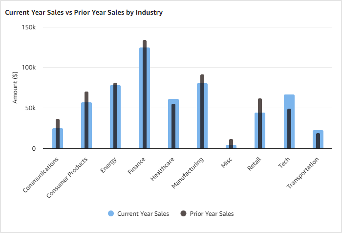
The following image shows a lipstick chart that is configured in the Chart code JSON editor of a Highcharts visual in Quick.
For more examples of visuals that you can create with the Highcharts visual in
Quick, see Highcharts
demos
Considerations
Before you start creating Highcharts visuals in Amazon Quick, review the following limitations that apply to Highcharts visuals.
-
The following JSON values are not supported in the Highcharts Chart code JSON editor:
-
Functions
-
Dates
-
Undefined values
-
-
Links to GeoJSON files or other images are not supported for Highcharts visuals.
-
Field colors are not available for Highcharts visuals. Default theme colors are applied to all Highcharts visuals.
Creating a Highcharts visual
Use the following procedure to create a Highcharts visual in Amazon Quick.
-
Open the Quick console
. -
Open the Quick analysis that you want to add a Highcharts visual to.
-
On the application bar, choose Add, and then choose Add visual.
-
On the Visual types pane, choose the Highcharts visual icon. An empty visual appears on the analysis sheet and the Properties pane opens on the left.
-
In the Properties pane, expand the Display settings section and perform the following actions:
-
For Edit title, choose the paintbrush icon, enter the title that you want the visual to have, and then choose SAVE. Alternatively, choose the eyeball icon to hide the title.
-
(Optional) For Edit subtitle, choose the paintbrush icon, enter the subtitle that you want the visual to have, and then choose SAVE. Alternatively, choose the eyeball icon to hide the subtitle.
-
(Optional) For Alt text, add the alt text that you want the visual to have.
-
-
Expand the Data point limit section. For Number of data points to show, enter the number of data points that you want the visual to show. Highcharts visuals can show up to 10,000 data points.
-
Expand the Chart code section.
-
Enter a JSON schema into the Chart code JSON editor. The editor provides contextual assistance and real time validation to ensure that your input JSON is configured properly. Any errors that Quick identifies can be viewed in the Errors dropdown. The example below shows a JSON schema that creates a lipstick chart that shows current year sales by industry.
{ "xAxis": { "categories": ["getColumn", 0] }, "yAxis": { "min": 0, "title": { "text": "Amount ($)" } }, "tooltip": { "headerFormat": "<span style='font-size:10px'>{point.key}</span><table>", "pointFormat": "<tr><td style='color:{series.color};padding:0'>{series.name}: </td><td style='padding:0'><b>${point.y:,.0f}</b></td></tr>", "footerFormat": "</table>", "shared": true, "useHTML": true }, "plotOptions": { "column": { "borderWidth": 0, "grouping": false, "shadow": false } }, "series": [ { "type": "column", "name": "Current Year Sales", "color": "rgba(124,181,236,1)", "data": ["getColumn", 1], "pointPadding": 0.3, "pointPlacement": 0.0 } ] } -
Choose APPLY CODE. Quick converts the JSON schema into a visual that appears in the analysis. To make changes to the rendered visual, update the appropriate properties in the JSON schema and choose APPLY CODE.
-
(Optional) Open the Reference dropdown to access links to helpful Highctarts reference material.
When you are happy with the rendered visual, close the properties pane. For more information about Quick Sight specific expressions that can be used to configure a Highcharts visual, see Amazon Quick JSON expression language for Highcharts visuals.
Interactive Highchart features
Highchart visualizations in Amazon Quick Sight support custom actions, highlighting, and custom field color consistencies, allowing you to create interactive and visually cohesive charts that integrate seamlessly with other Quick Sight visuals.
Custom actions
With custom actions, you can define specific behaviors for any data point in your Highchart visualizations. This feature seamlessly integrates with Quick Sight's existing action framework, enabling you to create interactive charts that respond to user clicks. The system currently supports single data point selection, giving you precise control over user interactions. Custom actions can be implemented across various chart types, including line charts, bar charts, and stacked bar charts, among others.
To implement custom actions, you'll need to modify your Highcharts JSON configuration. Add an event block to your series configuration, specifying the click event and the corresponding action. For example:
{
  "series": [{
    "type": "line",
    "data": ["getColumn", 1],
    "name": "value",
    "events": {
      "click": [
        "triggerClick", { "rowIndex": "point.index" }
      ]
    }
}]
This configuration enables click events on your chart's data points, allowing Quick Sight to handle custom actions based on the selected data.
Cross-visual highlighting
Cross-visual highlighting enhances the interactivity of your dashboards by creating visual connections between different charts. When a user selects elements in one chart, related elements in other visuals are automatically highlighted, while unrelated elements are dimmed. This feature helps users quickly identify relationships and patterns across multiple visualizations, improving data comprehension and analysis.
To enable cross-visual highlighting and maintain field color consistency, use
the quicksight clause in your Highcharts JSON configuration. This
clause acts as a bridge between Highcharts rendering and Quick's visual
interaction system. Here's an example of how to set it up:
{
  "quicksight": {
    "pointRender": ["updatePointAttributes", {
      "opacity": ["case",
        ["dataMarkMatch", ["getColumnName", 0], "series.name"],
        1,  // Full opacity for matching elements
        0.1 // Dim non-matching elements
      ],
      "color": ["getColumnColorOverrides", ["getColumnName", 0], "series.name"]
    }]
  }
}
This configuration uses Quick Sight's JSON expression language to dynamically modify visual properties like opacity and color based on user interactions and predefined color schemes.
For more complex scenarios, you can set up highlighting based on multiple conditions. This allows for more nuanced interactivity in your visualizations. The following example highlights elements based on either the quarter or day of the week:
{
  "quicksight": {
    "pointRender": ["updatePointAttributes", {
      "opacity": ["case",
        ["||",
          ["dataMarkMatch", "quarter", "series.name"],
          ["dataMarkMatch", "day_of_week", "point.name"]
        ],
        1,  // Full opacity for matching elements
        0.1 // Dim non-matching elements
      ],
    }]
  }
}
Field-level color consistency
Maintaining visual coherence across your dashboard is crucial for effective data interpretation. The field-level color consistency feature ensures that colors assigned to specific dimensions perist across all visuals in your dashboard. This consistency helps users quickly recognize and track particular data categories across different chart types and views, enhancing the overall user experience and data comprehension.