View an Autopilot model performance report
An Amazon SageMaker AI model quality report (also referred to as performance report) provides insights and quality information for the best model candidate generated by an AutoML job. This includes information about the job details, model problem type, objective function, and other information related to the problem type. This guide shows how to view Amazon SageMaker Autopilot performance metrics graphically, or view metrics as raw data in a JSON file.
For example, in classification problems, the model quality report includes the following:
-
Confusion matrix
-
Area under the receiver operating characteristic curve (AUC)
-
Information to understand false positives and false negatives
-
Tradeoffs between true positives and false positives
-
Tradeoffs between precision and recall
Autopilot also provides performance metrics for all of your candidate models. These metrics are calculated using all of the training data and are used to estimate model performance. The main working area includes these metrics by default. The type of metric is determined by the type of problem being addressed.
Refer to the Amazon SageMaker API reference documentation for the list of available metrics supported by Autopilot.
You can sort your model candidates with the relevant metric to help you select and deploy the model that addresses your business needs. For definitions of these metrics, see the Autopilot candidate metrics topic.
To view a performance report from an Autopilot job, follow these steps:
-
Choose the Home icon (
 ) from the left navigation pane to view the top-level
Amazon SageMaker Studio Classic navigation menu.
) from the left navigation pane to view the top-level
Amazon SageMaker Studio Classic navigation menu. -
Select the AutoML card from the main working area. This opens a new Autopilot tab.
-
In the Name section, select the Autopilot job that has the details that you want to examine. This opens a new Autopilot job tab.
-
The Autopilot job panel lists the metric values including the Objective metric for each model under Model name. The Best model is listed at the top of the list under Model name and it is highlighted in the Models tab.
-
To review model details, select the model that you are interested in and select View in model details. This opens a new Model Details tab.
-
-
Choose the Performance tab between the Explainability and Artifacts tab.
-
On the top right section of the tab, select the down arrow on the Download Performance Reports button.
-
The down arrow provides two options to view Autopilot performance metrics:
-
You can download a PDF of the performance report to view the metrics graphically.
-
You can view metrics as raw data and download it as a JSON file.
-
-
For instructions on how to create and run an AutoML job in SageMaker Studio Classic, see Create Regression or Classification Jobs for Tabular Data Using the AutoML API.
The performance report contains two sections. The first contains details about the Autopilot job that produced the model. The second section contains a model quality report.
Autopilot Job details
This first section of the report gives some general information about the Autopilot job that produced the model. These job details include the following information:
-
Autopilot candidate name
-
Autopilot job name
-
Problem type
-
Objective metric
-
Optimization direction
Model quality report
Model quality information is generated by Autopilot model insights. The report's content that is generated depends on the problem type it addressed: regression, binary classification, or multiclass classification. The report specifies the number of rows that were included in the evaluation dataset and the time at which the evaluation occurred.
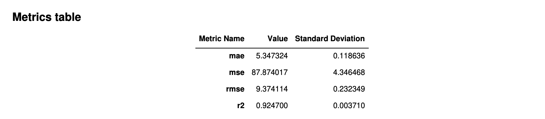
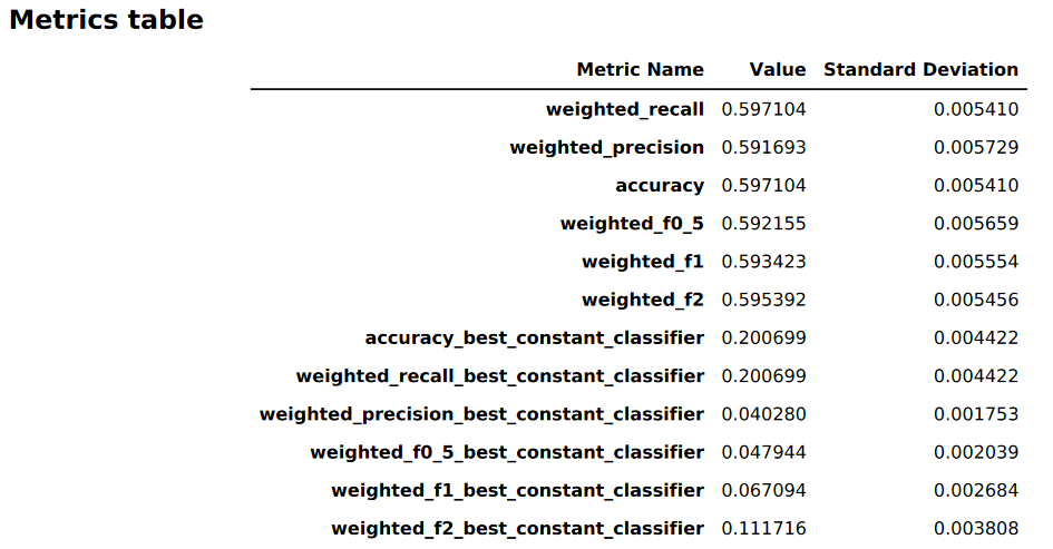
Metrics tables
The first part of the model quality report contains metrics tables. These are appropriate for the type of problem that the model addressed.
The following image is an example of a metrics table that Autopilot generates for a regression problem. It shows the metric name, value, and standard deviation.
The following image is an example of a metrics table generated by Autopilot for a multiclass classification problem. It shows the metric name, value, and standard deviation.
Graphical model performance information
The second part of the model quality report contains graphical information to help you evaluate model performance. The contents of this section depend on the problem type used in modeling.
The area under the receiver operating characteristic curve
The area under the receiver operating characteristic curve represents the trade-off between true positive and false positive rates. It is an industry-standard accuracy metric used for binary classification models. AUC (area under the curve) measures the ability the model to predict a higher score for positive examples, as compared to negative examples. The AUC metric provides an aggregated measure of the model performance across all possible classification thresholds.
The AUC metric returns a decimal value from 0 to 1. AUC values near 1
indicate that the machine learning model is highly accurate. Values near 0.5
indicate that the model is performing no better than guessing at random. AUC
values close to 0 indicate that the model has learned the correct patterns,
but is making predictions that are as inaccurate as possible. Values near
zero can indicate a problem with the data. For more information about the
AUC metric, see the Receiver operating characteristic
The following is an example of an area under the receiver operating characteristic curve graph to evaluate predictions made by a binary classification model. The dashed thin line represents the area under the receiver operating characteristic curve that a model which classifies no-better-than-random guessing would score, with an AUC score of 0.5. The curves of more accurate classification models lie above this random baseline, where the rate of true positives exceeds the rate of false positives. The area under the receiver operating characteristic curve representing the performance of the binary classification model is the thicker solid line.
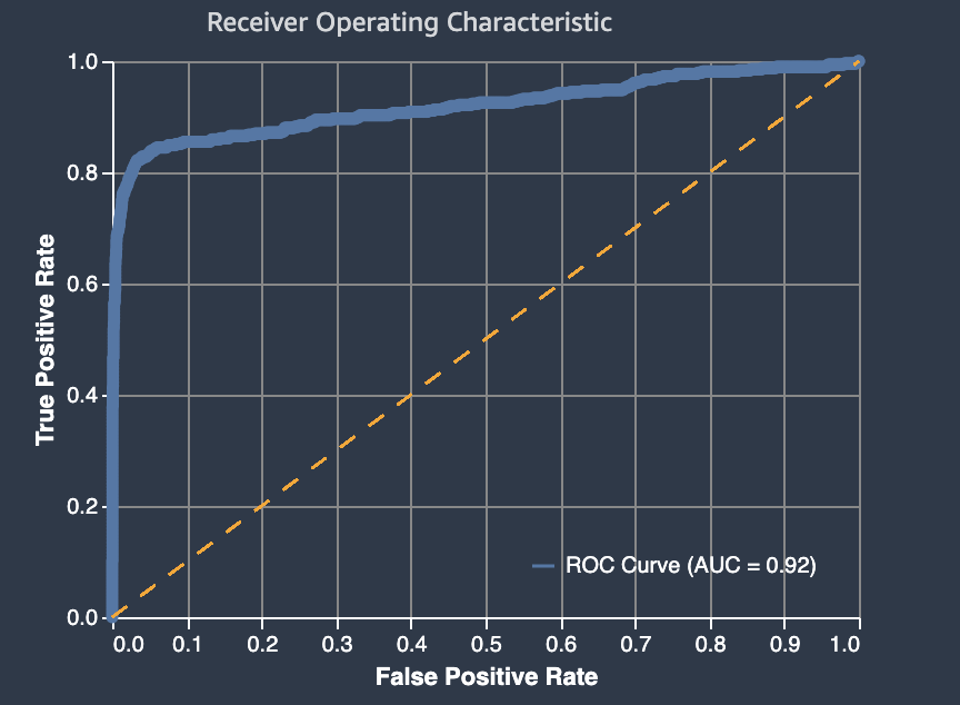
A summary of the graph's components of false positive rate (FPR) and true positive rate (TPR) are defined as follows.
-
Correct predictions
-
True positive (TP): The predicted value is 1, and the true value is 1.
-
True negative (TN): The predicted value is 0, and the true value is 0.
-
-
Erroneous predictions
-
False positive (FP): The predicted value is 1, but the true value is 0.
-
False negative (FN): The predicted value is 0, but the true value is 1.
-
The false positive rate (FPR) measures the fraction of true negatives (TN) that were falsely predicted as positives (FP), over the sum of FP and TN. The range is 0 to 1. A smaller value indicates better predictive accuracy.
-
FPR = FP/(FP+TN)
The true positive rate (TPR) measures the fraction true positives that were correctly predicted as positives (TP) over the sum of TP and false negatives (FN). The range is 0 to 1. A larger value indicates better predictive accuracy.
-
TPR = TP/(TP+FN)
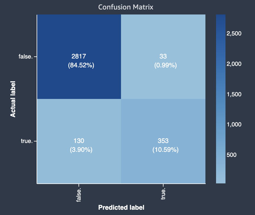
Confusion matrix
A confusion matrix provides a way to visualize the accuracy of the predictions made by a model for binary and multiclass classification for different problems. The confusion matrix in the model quality report contains the following.
-
The number and percentage of correct and incorrect predictions for the actual labels
-
The number and percentage of accurate predictions on the diagonal from the upper-left to the lower-right corner
-
The number and percentage of inaccurate predictions on the diagonal from the upper-right to the lower-left corner
The incorrect predictions on a confusion matrix are the confusion values.
The following diagram is an example of a confusion matrix for a binary classification problem. It contains the following information:
-
The vertical axis is divided into two rows containing true and false actual labels.
-
The horizontal axis is divided into two columns containing true and false labels that were predicted by the model.
-
The color bar assigns a darker tone to a larger number of samples to visually indicate the number of values that were classified in each category.
In this example, the model predicted actual 2817 false values correctly, and 353 actual true values correctly. The model incorrectly predicted 130 actual true values to be false and 33 actual false values to be true. The difference in tone indicates that the dataset is not balanced. The imbalance is because there are many more actual false labels than actual true labels.
The following diagram is an example of a confusion matrix for a multi-class classification problem. The confusion matrix in the model quality report contains the following.
-
The vertical axis is divided into three rows containing three different actual labels.
-
The horizontal axis is divided into three columns containing labels that were predicted by the model.
-
The color bar assigns a darker tone to a larger number of samples to visually indicate the number of values that were classified in each category.
In the example below, the model correctly predicted actual 354 values for label f, 1094 values for label i and 852 values for label m. The difference in tone indicates that the dataset is not balanced because there are many more labels for the value i than for f or m.
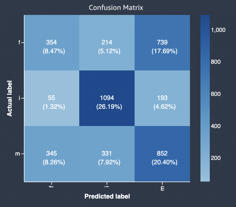
The confusion matrix in the model quality report provided can accommodate
a maximum of 15 labels for multiclass classification problem types. If a row
corresponding to a label shows a Nan value, it means that the
validation dataset used to check model predictions does not contain data
with that label.
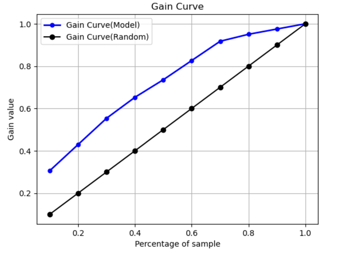
Gain curve
In binary classification, a gain curve predicts the cumulative benefit of using a percentage of the dataset to find a positive label. The gain value is calculated during training by dividing the cumulative number of positive observations by the total number of positive observations in the data, at each decile. If the classification model created during training is representative of the unseen data, you can use the gain curve to predict the percentage of data that you must target to obtain a percentage of positive labels. The greater the percentage of the dataset used, the higher the percentage of positive labels found.
In the following example graph, the gain curve is the line with changing slope. The straight line is the percentage of positive labels found by selecting a percentage of data from the dataset at random. Upon targeting 20% of the dataset, you would expect to find larger than 40% of the positive labels. As an example, you might consider using a gain curve to determine your efforts in a marketing campaign. Using our gain curve example, for 83% of people in a neighborhood to purchase cookies, you'd send an advertisement to about 60% of the neighborhood.
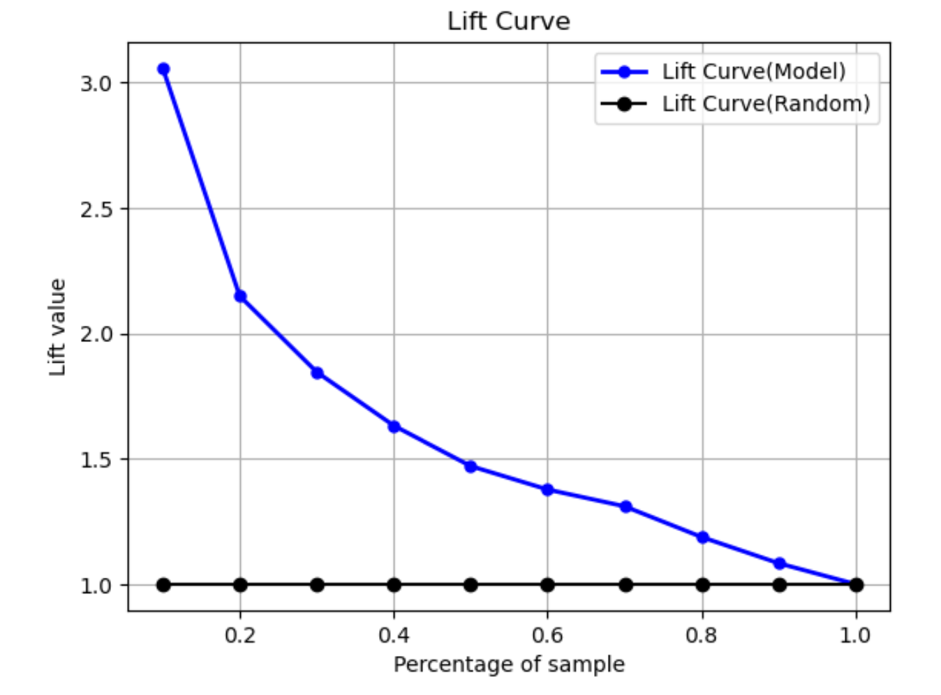
Lift curve
In binary classification, the lift curve illustrates the uplift of using a trained model to predict the likelihood of finding a positive label compared to a random guess. The lift value is calculated during training using the ratio of percentage gain to the ratio of positive labels at each decile. If the model created during training is representative of the unseen data, use the lift curve to predict the benefit of using the model over randomly guessing.
In the following example graph, the lift curve is the line with changing slope. The straight line is the lift curve associated with selecting the corresponding percentage randomly from the dataset. Upon targeting 40% of the dataset with your model's classification labels, you would expect to find about 1.7 times the number of the positive labels that you would have found by randomly selecting 40% of the unseen data.
Precision-recall curve
The precision-recall curve represents the tradeoff between precision and recall for binary classification problems.
Precision measures the fraction of actual positives that are predicted as positive (TP) out of all positive predictions (TP and false positive). The range is 0 to 1. A larger value indicates better accuracy in the predicted values.
-
Precision = TP/(TP+FP)
Recall measures the fraction of actual positives that are predicted as positive (TP) out of all actual positive predictions (TP and false negative). This is also known as the sensitivity or as the true positive rate. The range is 0 to 1. A larger value indicates better detection of positive values from the sample.
-
Recall = TP/(TP+FN)
The objective of a classification problem is to correctly label as many elements as possible. A system with high recall but low precision returns a high percentage of false positives.
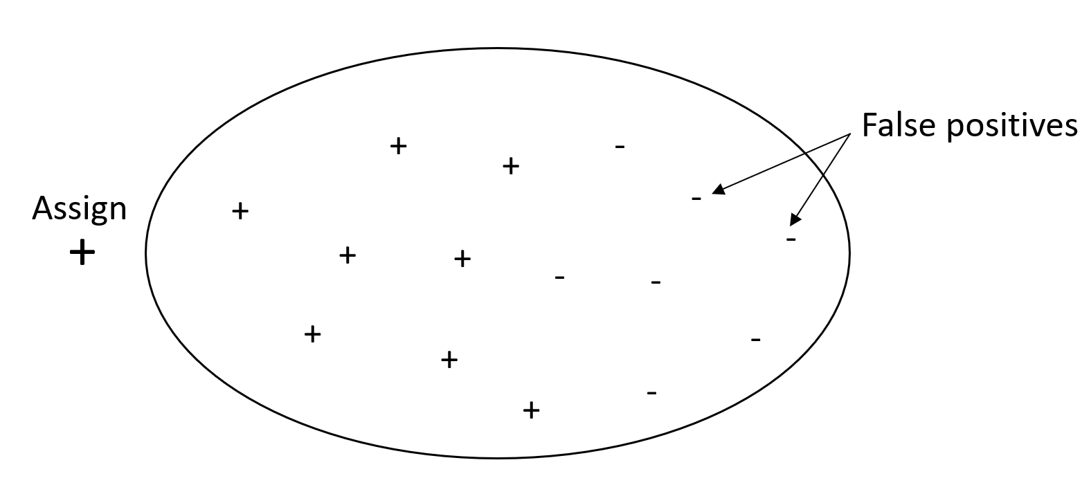
The following graphic depicts a spam filter that marks every email as spam. It has high recall, but low precision, because recall doesn't measure false positives.
Give more weight to recall over precision if your problem has a low penalty for false positive values, but a high penalty for missing a true positive result. For example, detecting an impending collision in a self-driving vehicle.
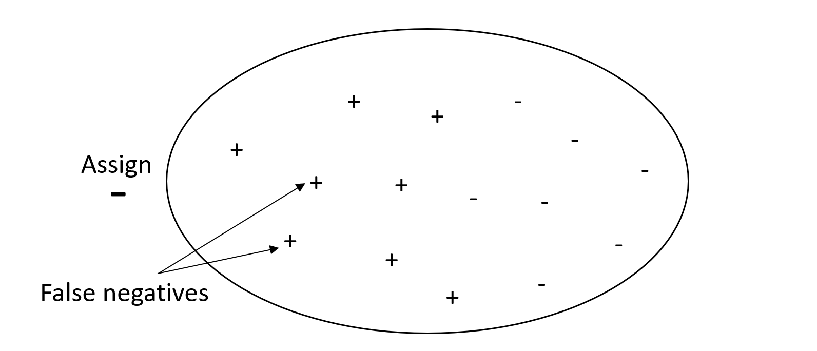
By contrast, a system with high precision, but low recall, returns a high percentage of false negatives. A spam filter that marks every email as desirable (not spam) has high precision but low recall because precision doesn't measure false negatives.
If your problem has a low penalty for false negative values, but a high penalty for missing a true negative results, give more weight to precision over recall. For example, flagging a suspicious filter for a tax audit.
The following graphic depicts a spam filter that has high precision but low recall, because precision doesn't measure false negatives.
A model that makes predictions with both high precision and high recall
produces a high number of correctly labeled results. For more information,
see Precision and recall
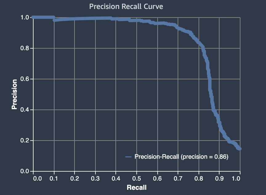
Area under precision-recall curve (AUPRC)
For binary classification problems, Amazon SageMaker Autopilot includes a graph of the area under the precision-recall curve (AUPRC). The AUPRC metric provides an aggregated measure of the model performance across all possible classification thresholds and uses both precision and recall. AUPRC does not take the number of true negatives into account. Therefore, it can be useful to evaluate model performance in cases where there's a large number of true negatives in the data. For example, to model a gene containing a rare mutation.
The following graphic is an example of an AUPRC graph. Precision at its highest value is 1, and recall is at 0. In the lower right corner of the graph, recall is its highest value (1) and precision is 0. In between these two points , the AUPRC curve illustrates the tradeoff between precision and recall at different thresholds.
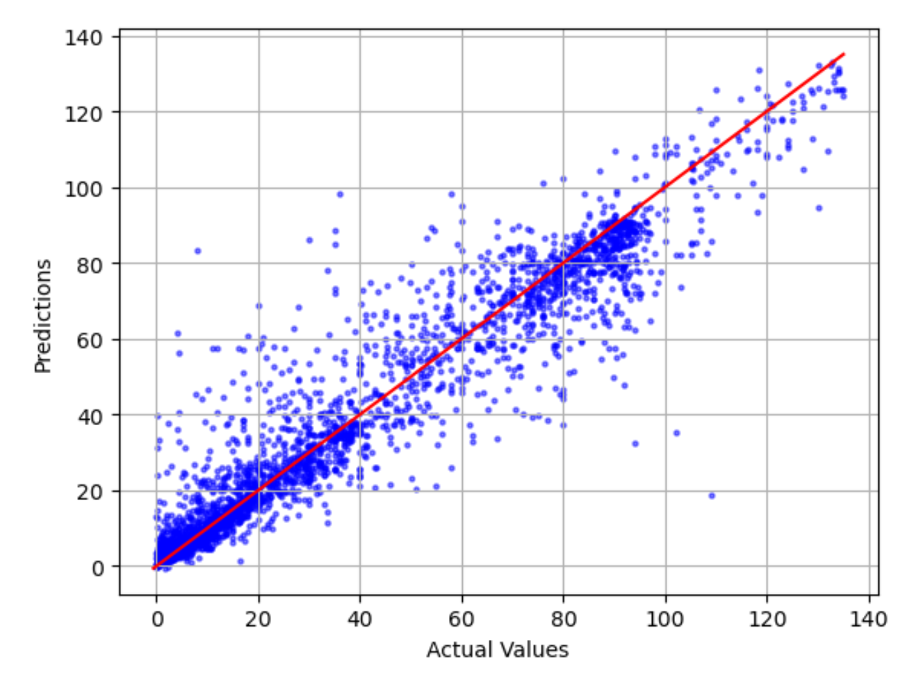
Actual against predicted plot
The actual against predicted plot shows the difference between actual and predicted model values. In the following example graph, the solid line is a linear line of best fit. If the model were 100% accurate, each predicted point would equal its corresponding actual point and lie on this line of best fit. The distance away from the line of best fit is a visual indication of model error. The larger the distance away from the line of best fit, the higher the model error.
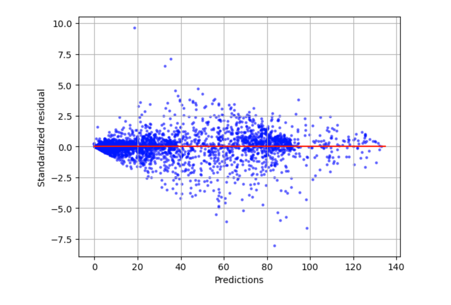
Standardized residual plot
A standardized residual plot incorporates the following statistical terms:
residual-
A (raw) residual shows the difference between actual and values predicted by your model. The larger the difference, the larger the residual value.
standard deviation-
The standard deviation is a measure of how values vary from an average value. A high standard deviation indicates that many values are very different from their average value. A low standard deviation indicates that many values are close to their average value.
standardized residual-
A standardized residual divides the raw residuals by their standard deviation. Standardized residuals have units of standard deviation and are useful in identifying outliers in data regardless of the difference in scale of the raw residuals. If a standardized residual is much smaller or larger than the other standardized residuals, it indicates that the model is not fitting these observations well.
The standardized residual plot measures the strength of the difference between observed and expected values. The actual predicted value is displayed on the x axis. A point with a value larger than an absolute value of 3 is commonly regarded as an outlier.
The following example graph shows that a large number of standardized residuals are clustered around 0 on the horizontal axis. The values close to zero indicate that the model is fitting these points well. The points towards the top and bottom of the plot are not predicted well by the model.
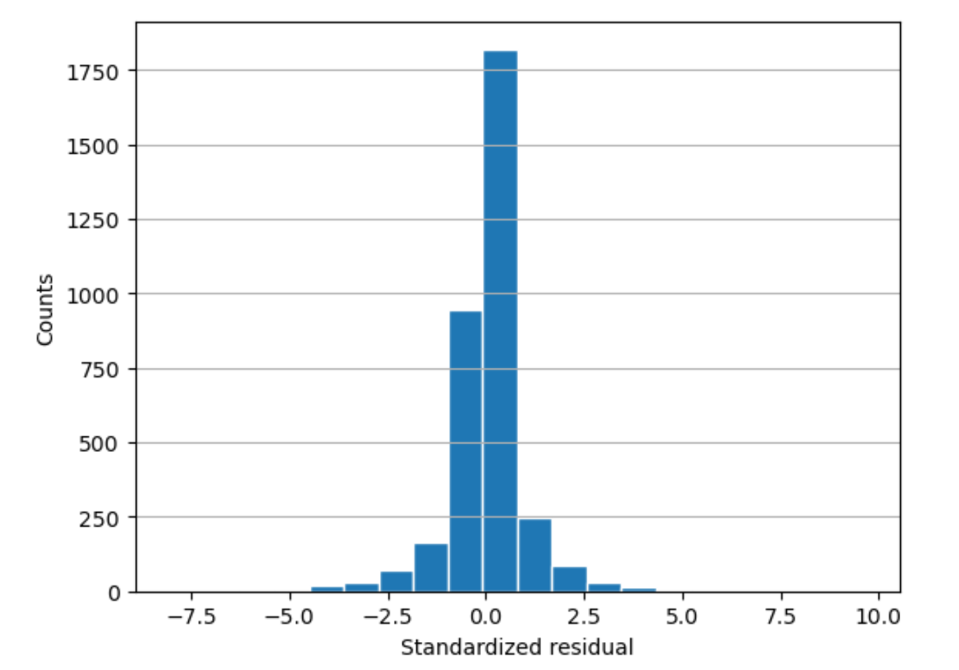
Residual histogram
A residual histogram incorporates the following statistical terms:
residual-
A (raw) residual shows the difference between actual and values predicted by your model. The larger the difference, the larger the residual value.
standard deviation-
The standard deviation is a measure of how much values vary from an average value. A high standard deviation indicates that many values are very different from their average value. A low standard deviation indicates that many values are close to their average value.
standardized residual-
A standardized residual divides the raw residuals by their standard deviation. Standardized residuals have units of standard deviation. These are useful in identifying outliers in data regardless of the difference in scale of the raw residuals. If a standardized residual is much smaller or larger than the other standardized residuals, it would indicate that the model is not fitting these observations well.
histogram-
A histogram is a graph that shows how often a value occurred.
The residual histogram shows the distribution of standardized residual values. A histogram distributed in a bell shape and centered at zero indicates that the model does not systematically overpredict or underpredict any particular range of target values.
In the following graphic, the standardized residual values indicate that the model is fitting the data well. If the graph showed values far away from the center value, it would indicate that those values don't fit the model well.