Interacting with the Analytics console
The Amazon X-Ray Analytics console is an interactive tool for interpreting trace data to quickly understand how your application and its underlying services are performing. The console enables you to explore, analyze, and visualize traces through interactive response time and time-series graphs.
When making selections in the Analytics console, the console constructs filters to reflect the selected subset of all traces. You can refine the active dataset with increasingly granular filters by clicking the graphs and the panels of metrics and fields that are associated with the current trace set.
Topics
Console features
The X-Ray Analytics console uses the following key features for grouping, filtering, comparing, and quantifying trace data.
| Feature | Description |
|---|---|
|
Groups |
The initial selected group is |
|
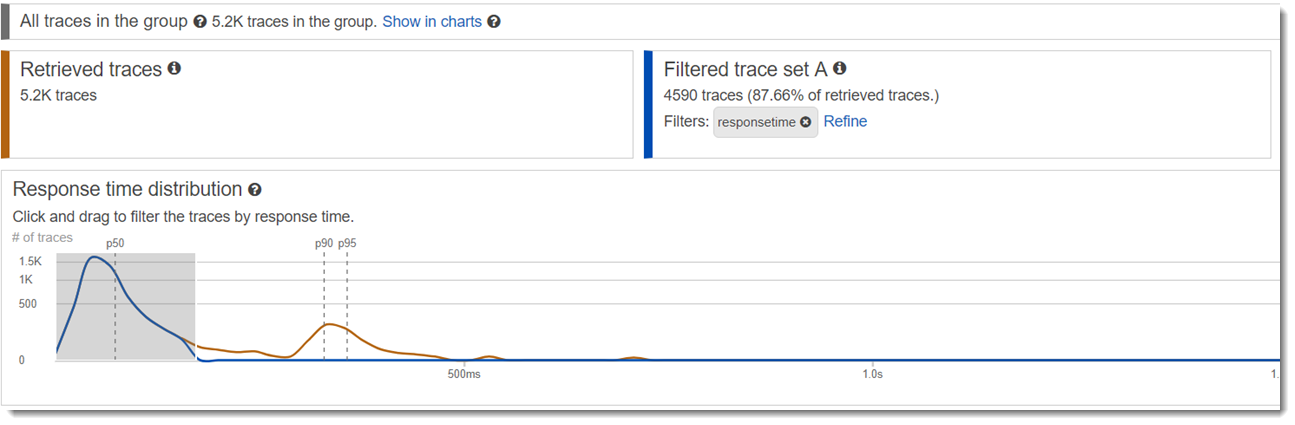
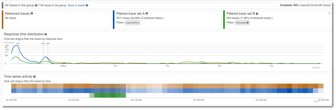
Retrieved traces |
By default, the Analytics console generates graphs based on all traces in the selected group. Retrieved traces represent all traces in your working set. You can find the trace count in this tile. Filter expressions you apply to the main search bar refine and update the retrieved traces. |
|
Show in charts/Hide from charts |
A toggle to compare the active group against the retrieved traces. To compare the data related to the group against any active filters, choose Show in charts. To remove this view from the charts, choose Hide from charts. |
|
Filtered trace set A |
Through interactions with the graphs and tables, apply filters to create the criteria for Filtered trace set A. As the filters are applied, the number of applicable traces and the percentage of traces from the total that are retrieved are calculated within this tile. Filters populate as tags within the Filtered trace set A tile and can also be removed from the tile. |
|
Refine |
This function updates the set of retrieved traces based on the filters applied to trace set A. Refining the retrieved trace set refreshes the working set of all traces retrieved based on the filters for trace set A. The working set of retrieved traces is a sampled subset of all traces in the group. |
|
Filtered trace set B |
When created, Filtered trace set B is a copy of Filtered trace set A. To compare the two trace sets, make new filter selections that will apply to trace set B, while trace set A remains fixed. As the filters are applied, the number of applicable traces and the percentage of traces from the total retrieved are calculated within this tile. Filters populate as tags within the Filtered trace set B tile and can also be removed from the tile. |
|
Response time root cause entity paths |
A table of recorded entity paths. X-Ray determines which path in your trace is the most likely cause for the response time. The format indicates a hierarchy of entities that are encountered, ending in a response time root cause. Use these rows to filter for recurring response time faults. For more information about customizing a root cause filter and getting data through the API see, Retrieving and refining root cause analytics. |
|
Delta (�) |
A column that is added to the metrics tables when both trace set A and trace set B are active. The Delta column calculates the difference in percentage of traces between trace set A and trace set B. |
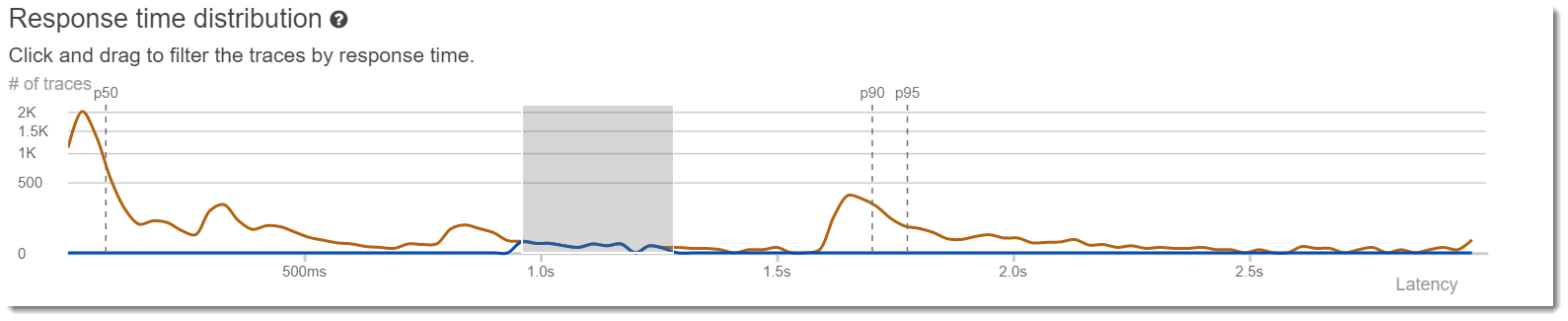
Response time distribution
The X-Ray Analytics console generates two primary graphs to help you visualize traces: Response Time Distribution and Time Series Activity. This section and the following provide examples of each, and explain the basics of how to read the graphs.
The following are the colors associated with the response time line graph (the time series graph uses the same color scheme):
-
All traces in the group – gray
-
Retrieved traces – orange
-
Filtered trace set A – green
-
Filtered trace set B – blue
Example– Response time distribution
The response time distribution is a chart that shows the number of traces with a given response time. Click and drag to make selections within
the response time distribution. This selects and creates a filter on the working trace set named
responseTime
for all traces within a specific response time.
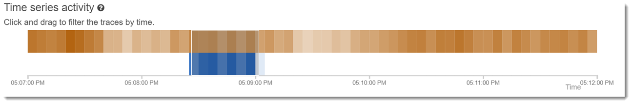
Time series activity
The time series activity chart shows the number of traces at a given time period. The color indicators mirror the line graph colors of the response time distribution. The darker and fuller the color block within the activity series, the more traces are represented at the given time.
Example– Time series activity
Click and drag to make selections within the time series activity graph. This selects and creates a
filter named timerange on the working trace set for all traces within a specific range of
time.
Workflow examples
The following examples show common use cases for the X-Ray Analytics console. Each example demonstrates a key function of the console experience. As a group, the examples follow a basic troubleshooting workflow. The steps walk through how to first spot unhealthy nodes, and then how to interact with the Analytics console to automatically generate comparative queries. Once you have narrowed the scope through queries, you will finally look at the details of traces of interest to determine what is damaging the health of your service.
Observe faults on the service graph
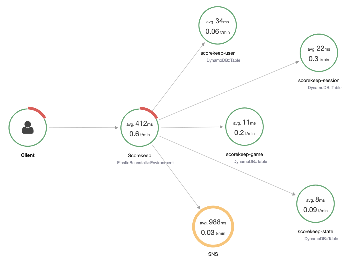
The trace map indicates the health of each node by coloring it based on the ratio of successful calls to errors and faults. When you see a percentage of red on your node, it signals a fault. Use the X-Ray Analytics console to investigate it.
For more information about how to read the trace map, see Viewing the trace map.
Identify response time peaks
Using the response time distribution, you can observe peaks in response time. By selecting the peak in response time, the tables below the graphs will update to expose all associated metrics, such as status codes.
When you click and drag, X-Ray selects and creates a filter. It's shown in a gray shadow on top of the graphed lines. You can now drag that shadow left and right along the distribution to update your selection and filter.
View all traces marked with a status code
You can drill into traces within the selected peak by using the metrics tables below the graphs. By
clicking a row in the HTTP STATUS CODE table, you automatically create a filter on the
working dataset. For example, you could view all traces of status code 500. This creates a filter tag in the
trace set tile named http.status.
View all items in a subgroup and associated to a user
Drill into the error set based on user, URL, response time root cause, or other predefined attributes. For
example, to additionally filter the set of traces with a 500 status code, select a row from the
USERS table. This results in two filter tags in the trace set tile:
http.status, as designated previously, and user.
Compare two sets of traces with different criteria
Compare across various users and their POST requests to find other discrepancies and correlations. Apply your first set of filters. They are defined by a blue line in the response time distribution. Then select Compare. Initially, this creates a copy of the filters on trace set A.
To proceed, define a new set of filters to apply to trace set B. This second set is represented by a green line. The following example shows different lines according to the blue and green color scheme.
Identify a trace of interest and view its details
As you narrow your scope using the console filters, the trace list below the metrics tables becomes more meaningful. The trace list table combines information about URL, USER, and STATUS CODE into one view. For more insights, select a row from this table to open the trace's detail page and view its timeline and raw data.